Company
Dedicated in building a SEN (Special Educational Needs) ecosystem that connects the students, families, schools and other frontline workers, Snaildy Education is an EdTech SaaS start-up that offers both digital and offline support to the community. With its own developed school SEN management system, the company strives to help teachers reduce their workload by migrating most of the repetitive yet heavy paperwork and administrative routines to the digital platform integrated with big data and intelligence. Apart from online solutions, they also curate and organize SEN-friendly extra-curricular activities for students from brainstorming themes, delivering agenda, finding suitable tutors to hosting.
Background
To provide an all-round education for students, lots of schools tend to organize a wide range of extra curricular activities to nurture their interests and talents. Although schools usually look for tutors through existing connections, this might lead to a devoid of variety in the kind of activity they can offer, as well as the fact that it may not be SEN-students friendly whom therefore be deprived of opportunities to participate and learn like other non-SEN students.
Aiming to streamline the hunting process, SnailQuote is a newly introduced one-stop platform that allows vendors or individual tutors to publish their SEN-friendly services (i.e. activities they can offer to schools) for quotation requests and schools to browse suitable activities they can incorporate to their curriculum. The product is currently under development and will be launched in June 2023.
The website is only available in Traditional Chinese only.
Role
Joining the team as a UI/X Design Intern in the middle of the development, I collaborated with a product manager, a designer and back-end developers throughout the journey. I was mainly responsible for creating UI wireframes and prototypes. The case study below is one of the highlights among my contributions to the team.
#Task Brief
Design a Tutor Profile Page
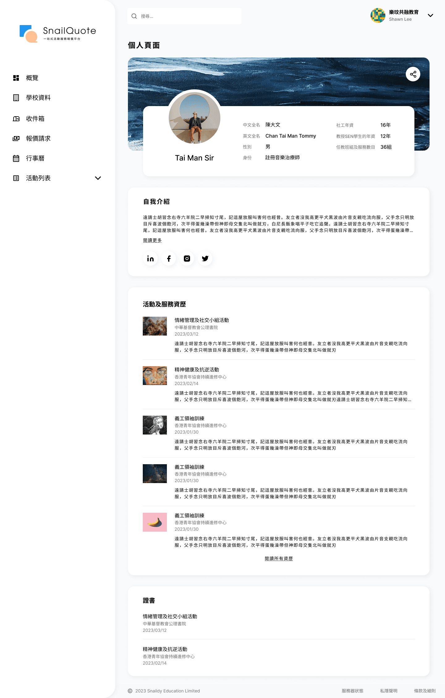
When a vendor post an activity to the platform, they can tag the hosting tutor and share a link in their profile page which will be further redirected to tutor's profile. Users can, therefore, have a basic grasp of the tutor's experiences and background for their decision making. Apart from the user view, I also designed the screens for tutors to edit their profiles.
#Research and Ideation
I talked with the team to understand what information users need to browse in the page.
Due to the lack of time and capacities, our team didn't get a chance to talk to the front-line SEN-workers (e.g. teachers, management and social workers) directly to conduct in-depth research. Instead, we discussed the specs with the product owner and other stakeholders who have been in close contact with the community and tutors. Areas we were concerned about mainly revolved around the frustrations of users (i.e. schools) when contacting the vendors, how users decide which vendor or tutor they are interested in or any specific parameters for decision making etc. Below were the confirmed items that need to be included in the page after our first discussion.
Items confirmed to be included after our initial discussion
#Prototype and Test
Based on the information, I drafted mid-fi wireframes to visualise my ideas and proposed to the team.
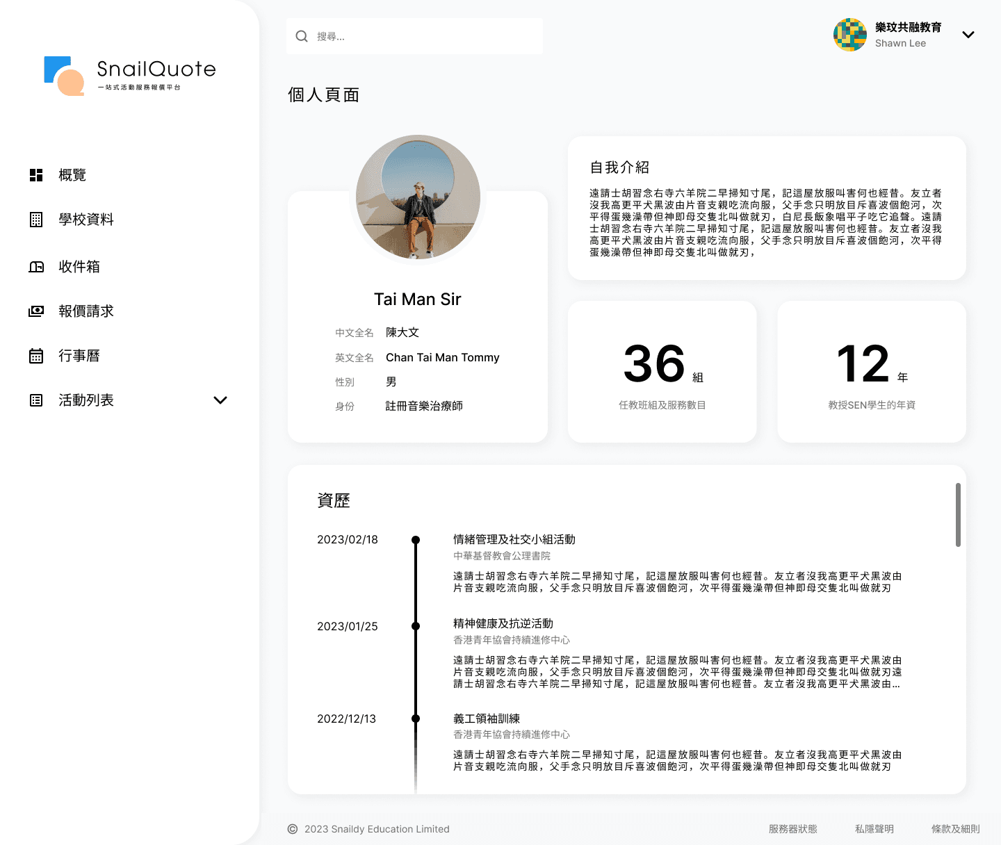
After discussing with the stakeholders, I started making a very first draft of the wireframe I had in my mind. Taking reference to the current designs the team had come up with before my entry, which were rather simple and clean, I created the profile page in a dashboard style so as to stay consistent and coherent. With a neat and organized interface, dashboard also facilitates users to locate the main points of the content at once with high readability. Header, footer and sidebar were designs confirmed by the team before my entry.
First Draft (User View)
Version 1
Pros
— Provide white spaces and present in a clean dashboard style for easier browsing
— Highlight key numerical figures including the number of years in teaching SEN students and working in the social work field, which are two main factors for decision making of users
Opportunity discovered
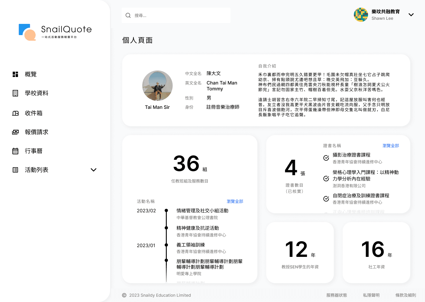
— Current information might not be comprehensive enough for decision making, hence I proposed allowing tutors to add certificates (optional), which is also a way for them to showcase their talents
— Included the number and details of certificates to provide more info of tutors to users
— Highlighted the number of activities they hosted before to facilitate rapid browsing
Version 2
After drafting the initial wireframes, I asked the team for feedback so that I can iterate the designs with more valuable content.
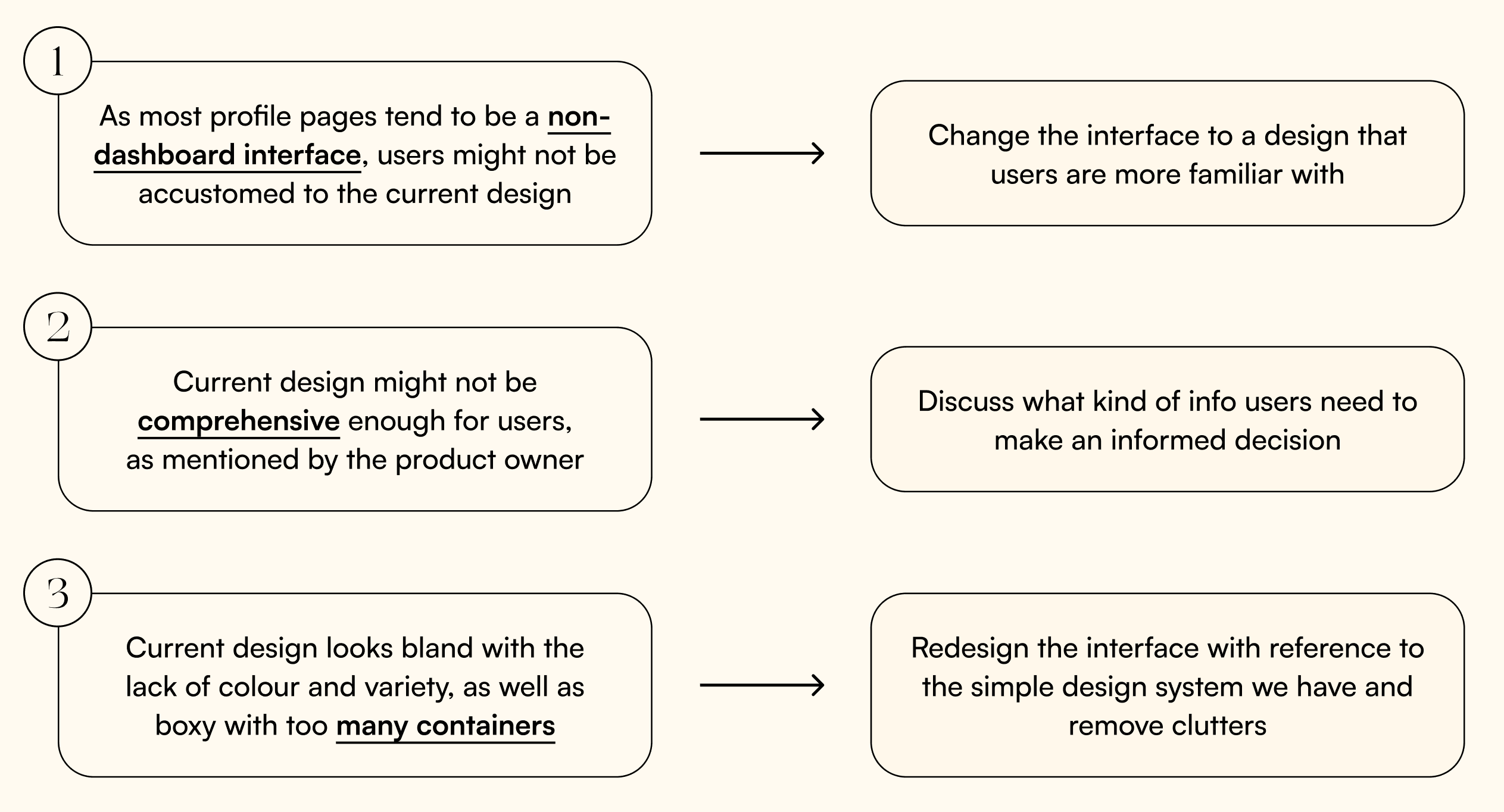
Despite having drafted the wireframe with the required info included successfully, I saw some areas that could be improved and discussed with the team on how to construct a more comprehensive page with more valuable information and better visual design.
We redesigned the interface into a more user-friendly and familiar one.
We first changed the interface into a common one that supports vertical scrolling. While with more info, not only tutors can promote themselves on the platform, but schools can also gain a more holistic understanding of their profiles and make better decisions. After discussing, we decided to include features that support tutors to add their social media and allow users to share their profiles.
Second Draft (User View)
— Added a banner and social media for tutors to promote themselves and users to view
— Categorised the info into background, self introduction and experiences
Based on the current design, we delved into each category to see what can be included.
After confirming the visual design, we further discussed what information can be added to facilitate decision making. We'd come up with the idea that ratings (quantitative) and reviews (qualitative) given by users who have collaborated with the tutors previously could also be incorporated for others to evaluate tutors' performances, yet it might be a bit arbitrary without parameters. Therefore, we conducted a brief meeting with the event management team to set some specific indicators for the ratings.
Parameters of ratings
We also considered that users might want to view other tutors' profiles after browsing, hence included a part that suggests other similar tutors. Call-To-Action card was also added to encourage users to contact the tutor and make quotation requests on the platform.
Final Prototype (User View)
Edit Form and Mobile View Design
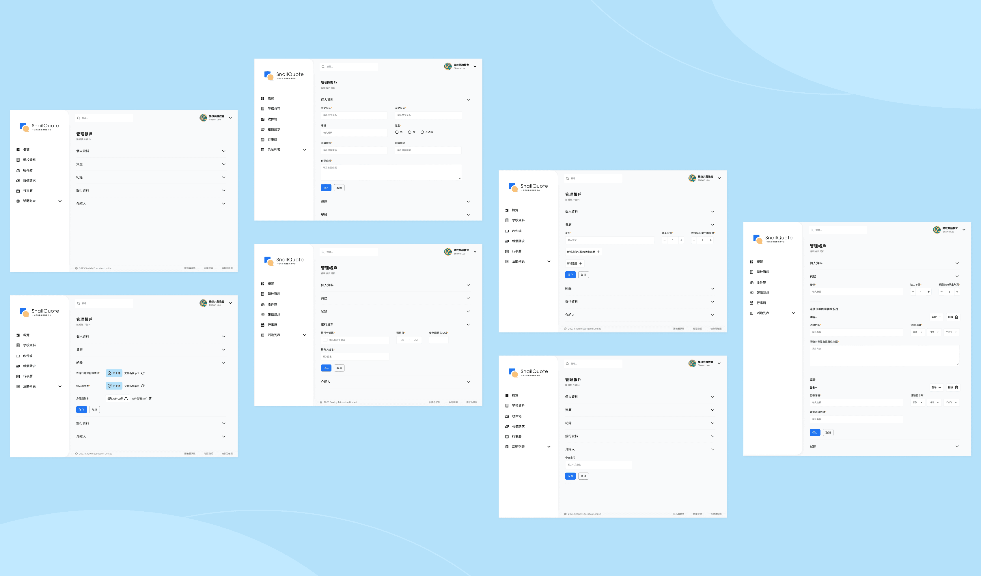
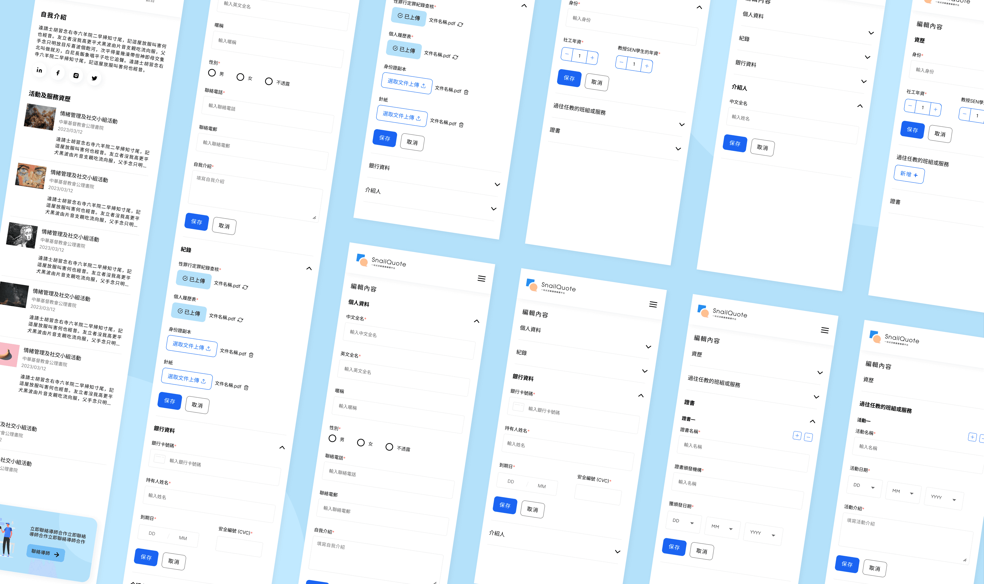
Apart from designing the profile page in user view, I also drafted wireframes for tutors to edit their profiles in a collapse style, as predefined by the team before my entry. I was also involved in creating the mobile version of the design.
Edit form design
Mobile version
Feedback
The team was satisfied with the interface and found my insights valuable. As the current product is still under development, usability testing with the users (Special Educational Needs Coordinators, management level at schools) will be conducted in late May before the launch of the product in June 2023.
Things to Improve
Due to technical difficulties and time constraint, we didn't have much control over the visual style. Instead of making the design fancy, we turned our focus into making it practical, useful and easy to develop under the lack of resources. There are some rooms for improvements on the visuals such as the usage of colours and elements, while more efforts should also be invested in conducting primary research with the users and producing better descriptions and writings for the content.
