Company
Dedicated in building a SEN (Special Educational Needs) ecosystem that connects students, families, schools and other frontline workers, Snaildy Education is an EdTech SaaS start-up that offers both online and offline support to the community. With its own developed school SEN management system, the company strives to help teachers reduce their workload by migrating most of the repetitive yet heavy paperwork and administrative routines to the digital platform integrated with big data and intelligence. Apart from online solutions, they also create SEN-friendly extra-curricular activities for students from curating, delivering agenda, finding suitable tutors to hosting.
Background
With the aim to reduce the paper workload of SENCO (Special Educational Needs Coordinator) at schools, the company released a Cloud platform that helps document student profiles such as their academic, behavioural and medical records, as well as reports with Speech Therapists and Educational Psychologists. To ease teachers' workload, it also supports bulk import and export of documents which can be directly sent to the Education Bureau for inspection and documentation.
Having been launched for almost two years, the system has lots of glitches on the UX and visual design. Hence, we started to redesign the product by optimizing the database and introducing more features.
The website is only available in Traditional Chinese only.
Role
Joining the team as a UI/X Design Intern in the middle of the development, I collaborated with a product manager, a designer and back-end developers throughout the journey. I was mainly responsible for creating UI wireframes and prototypes. Below are some of the highlights among my contributions to the team.
#Research
I conducted a simple heuristic evaluation on the current product.
Due to the lack of time and resources, we didn't get a chance to talk to the users directly for primary research. Yet, I conducted a simple heuristic evaluation on the current system to get familiar and more importantly, understand what helps and frustrates users with the current design.
Problem #1: Inconsistent visual design
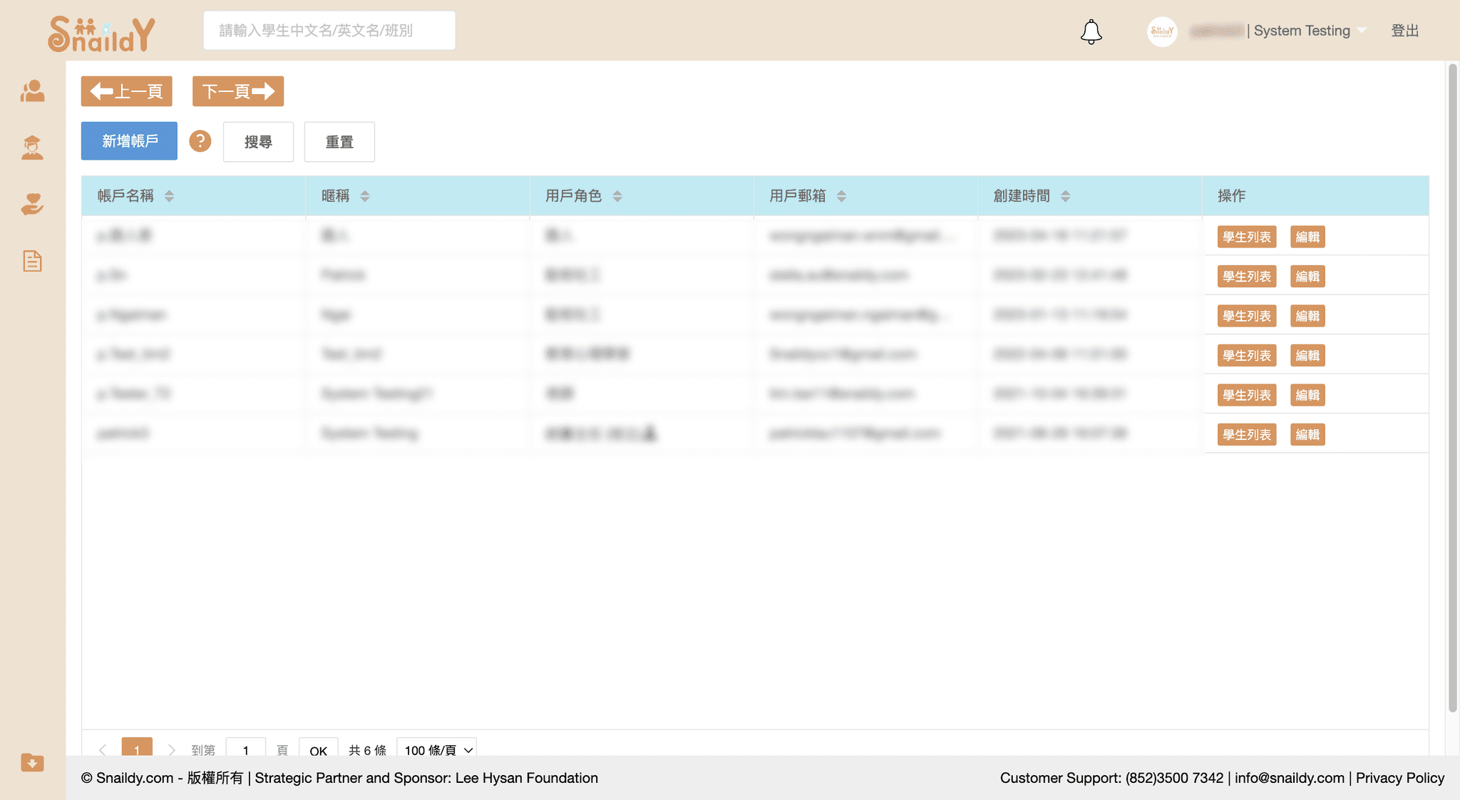
At first glance, the original design did not have a consistent use of design styles including colours, buttons and typography, hence might look confusing to users. The art direction of the website also looked outdated thus not visually appealing.
Original design of the homepage
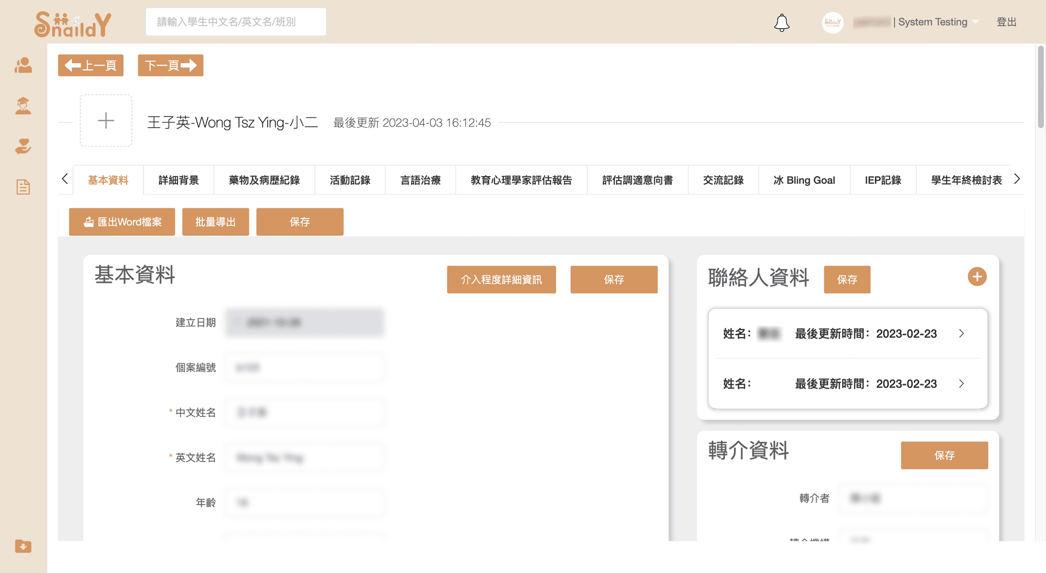
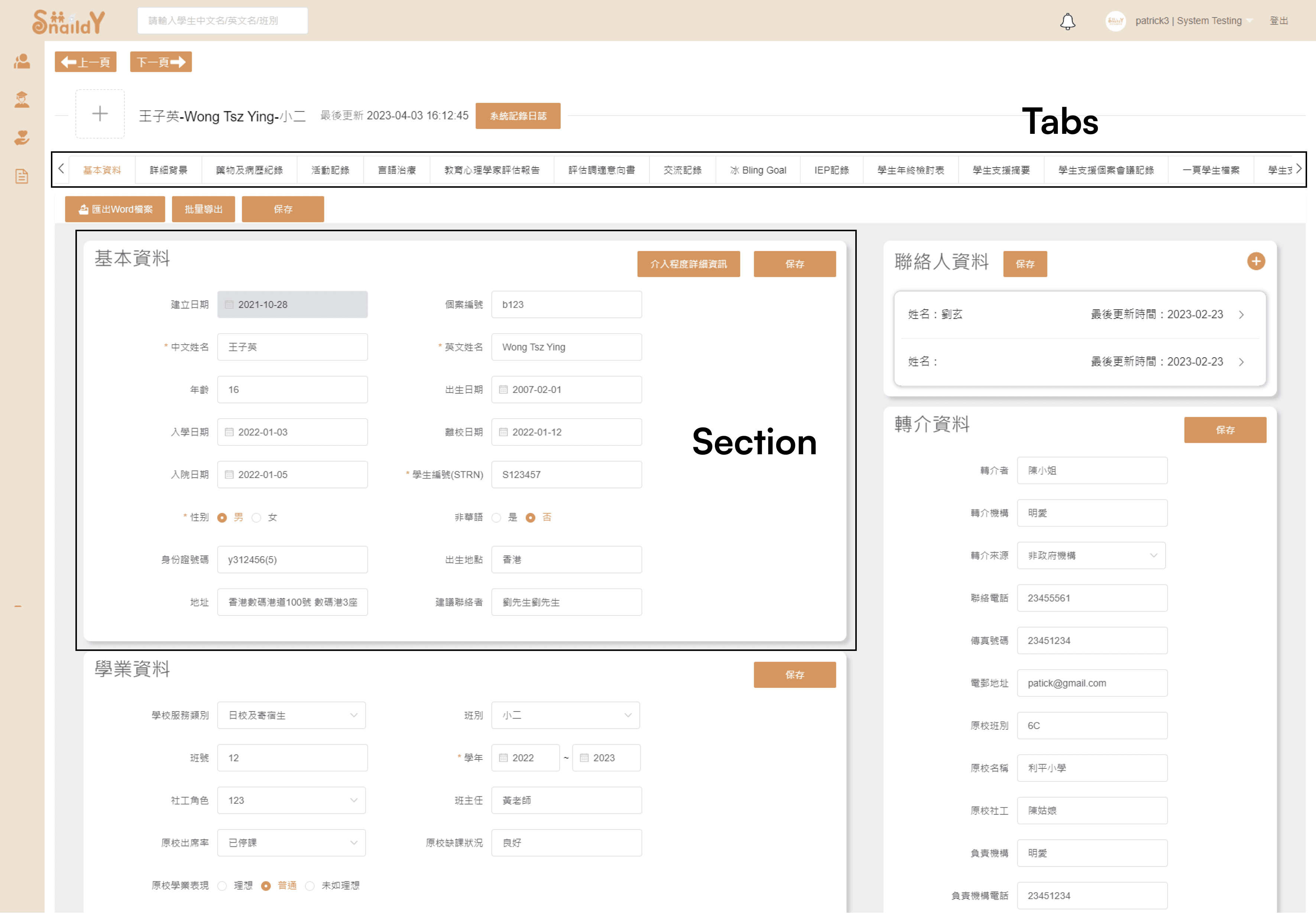
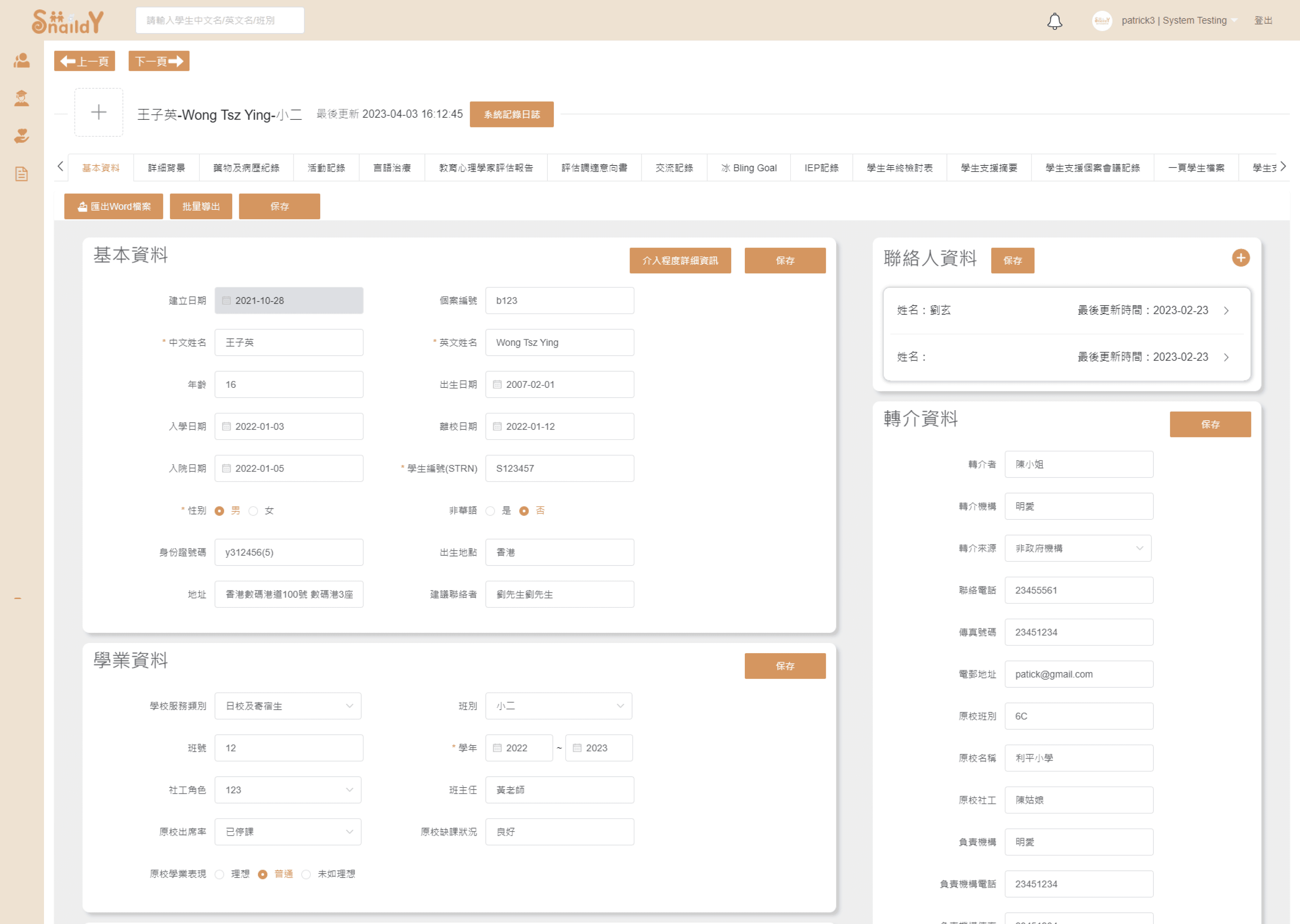
Original design of the student profile
Problem #2: Poor navigation
Without clear navigation elements that guides users in each step, they might be frustrated and take a lot of extra efforts to achieve their goals. Without structured navigation components in a website, especially a system with a myriad of functions, users are unsure how to navigate through the platform and understand the functions. Navigating over 15 tabs under the same page by scrolling horizontally might also not be a good approach.
#Ideation
I discussed with the team on how to improve the user experience and and proposed feasible solutions.
In general, the system was not user-friendly and hard to navigate through due to inconsistent design and navigation problems. Before designing, we first discussed on how to enhance the user experience and proposed some feasible solutions to develop.
We reimagined the architecture of the system to improve user experience.
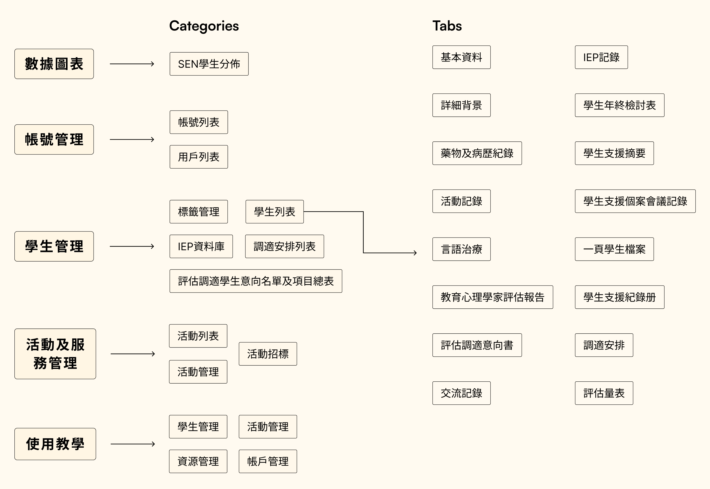
With well-designed navigation components, we believe that users can better understand the hierarchy and features of this versatile product. As there were some duplicated functions and unorganized tabs in the current version, we first discussed on what categories and tabs we would like to keep in the new design and make them less complicated for users to read through. After talking with the product owner and other stakeholders who have been in close contact with the users, we trimmed down the content and hierarchy.
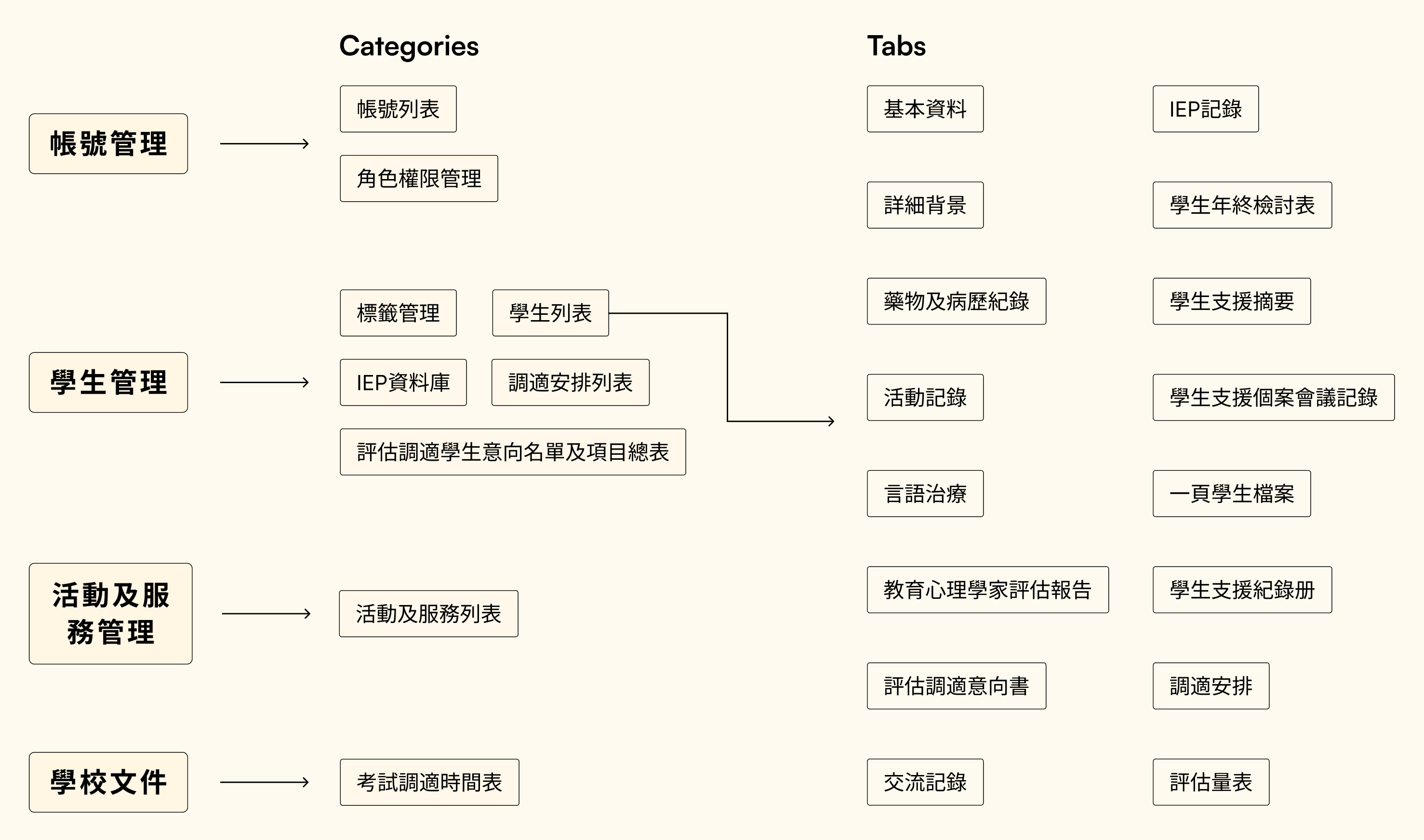
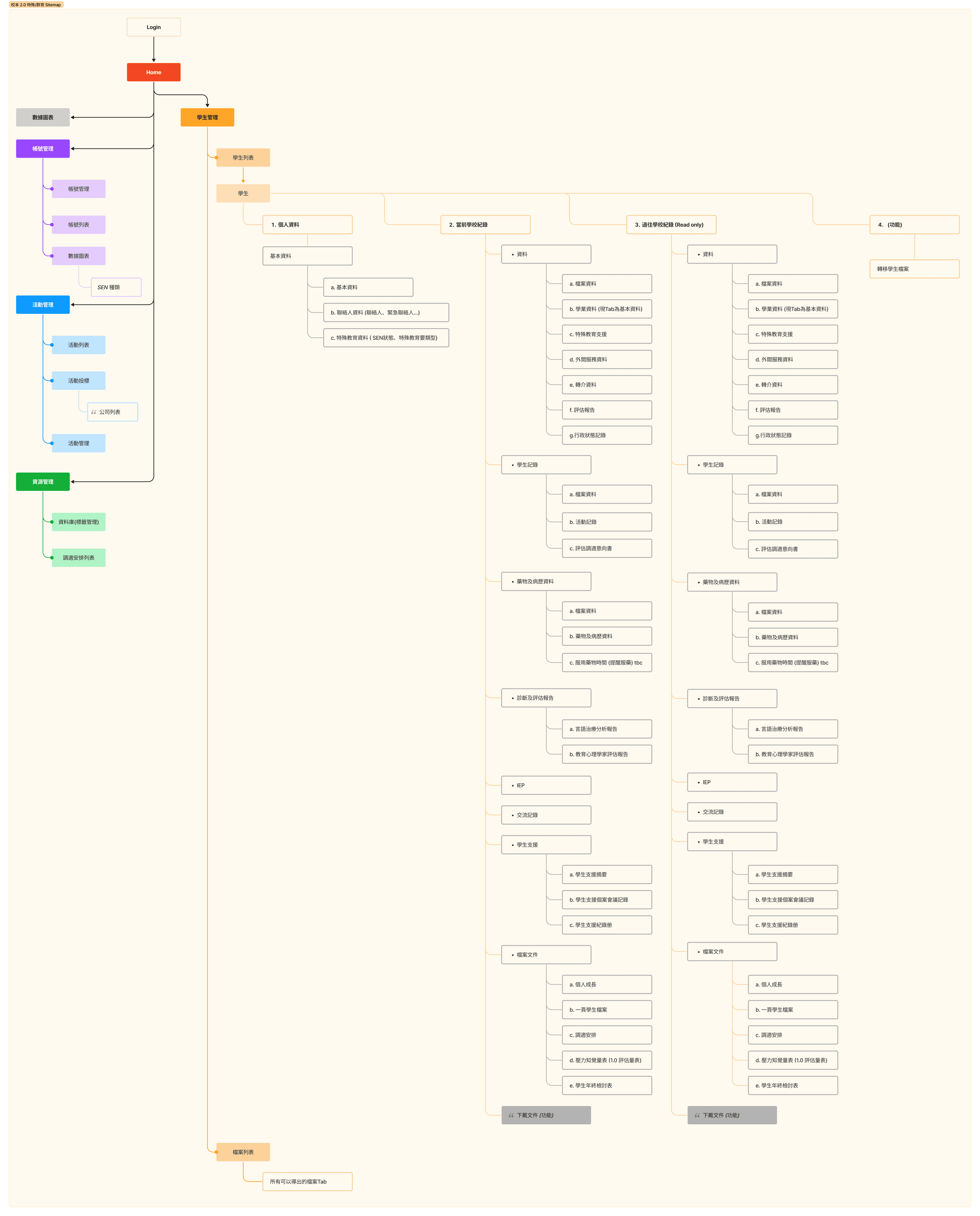
Simplified sitemap of the original design
Initial sitemap for the new design
Considering the usability, technical feasibility and business needs, we redesigned the architecture of the system and introduced new categories including the analytics of SEN student demographics for viewing, as well as tutorials for first-time users to guide them through the journey.
#Prototype and Test
We first created a simple set of design styles to follow through.
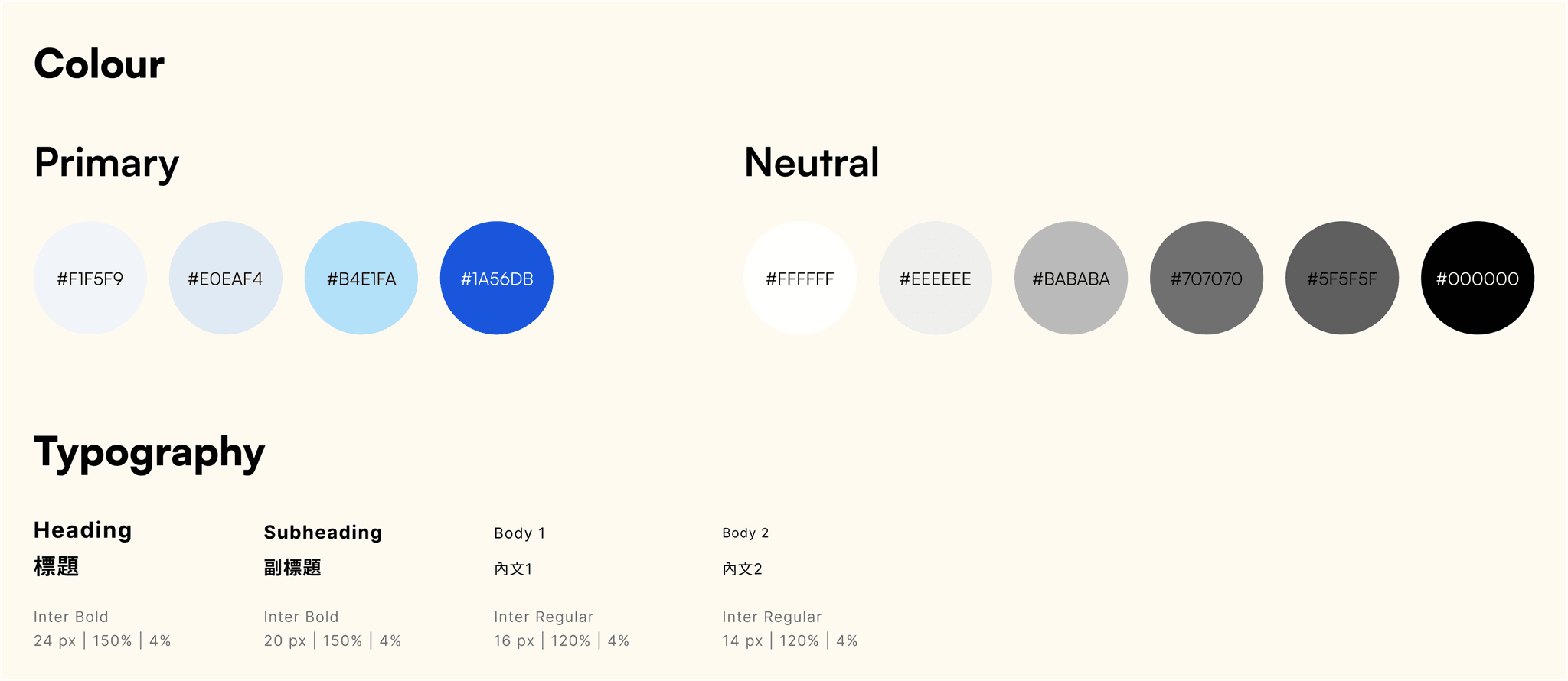
A design system is crucial in creating a consistent and coherent style for a product. Despite the fact that we didn't get a chance to develop a comprehensive set to follow owing to the time constraint and other difficulties, we confirmed the colours and typography for drafting wireframes afterwards.
Simple design styles
Based on the newly created sitemap, we proceeded to brainstorm possible solutions to solve the navigation problems.
With reference to the old design, we continued to brainstorm ideas on how users navigate through the platform including the global and local navigation routes.
#1: Global Navigation
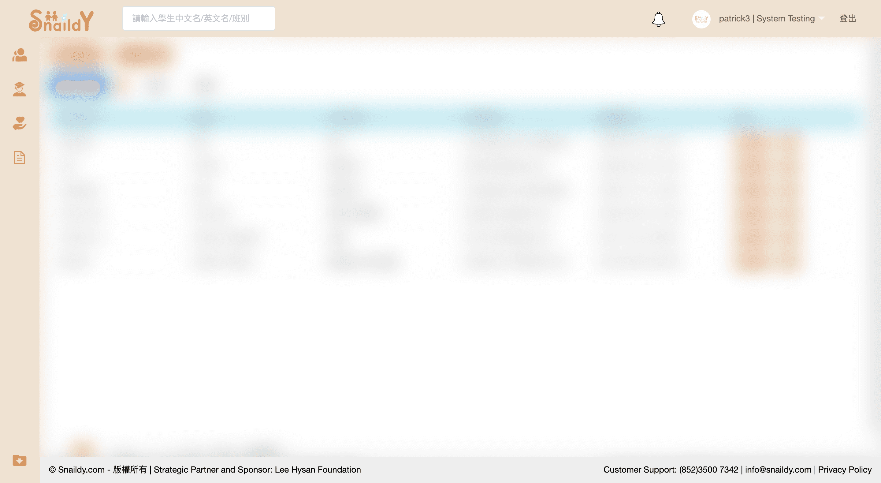
Original design of the header and global navigation bar
Cons
— No clue of the location and what they are editing due to the lack of visual hints
— Incomprehensible icons without descriptive text
— Non-intuitive and visually unappealing design
Due to the lack of time and resources, the backend team suggested an initial design to develop.
Con
— Lack key functions and features such as user profile and search bar
New header design proposed by the backend team
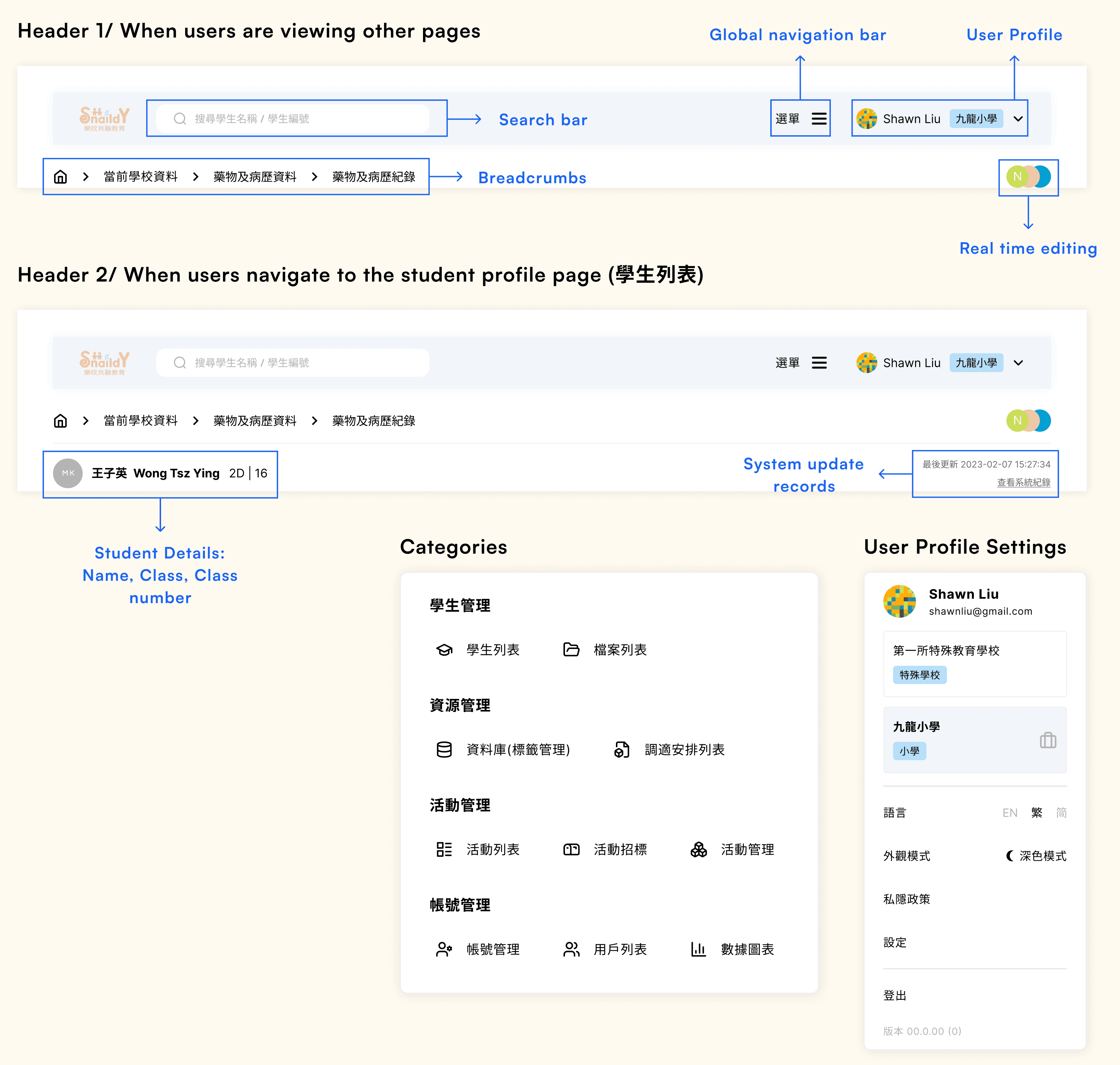
Modified design
Pros
— Added logo, user profile, search bar and system update records to provide more information for users
— Introduced breadcrumbs for easier navigation
Con
— Incomprehensible and confusing icons without descriptive text
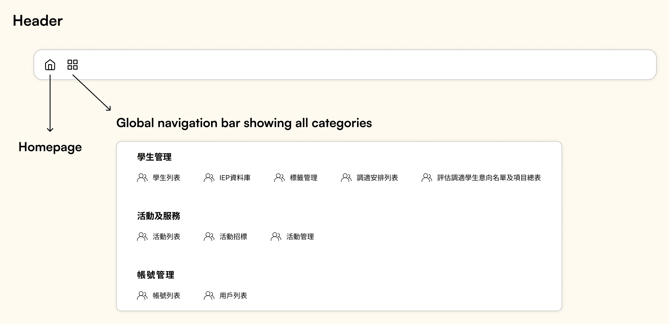
Considering the backend dev difficulties and business needs, we slightly amended the architecture. I then created hi-fi based on the revised structure.
— Support collaborative real-time editing and allow users to see the locations of others
— Grouped four tabs that aren't frequently used by users under student management page to simplify the design and enhance usability
— Postponed tutorials to a later development phase concerning the impact and time constraint
Final design
#2: Student List/ Profile Page
Users can edit the profile of each student when they navigate to this page. Information such as student background and contacts of their parents, medical records and reports, special educational needs during exam and lessons, as well as the activities they participated at school could also be stored in the system for documentation and exporting.
As the company aims to expand their target groups from SEN schools to other primary and secondary schools, they would like to introduce a new feature that supports cross transfer of student data from one school to another on the platform, aiming to reduce the efforts in manually inputting the details of students who already have records.
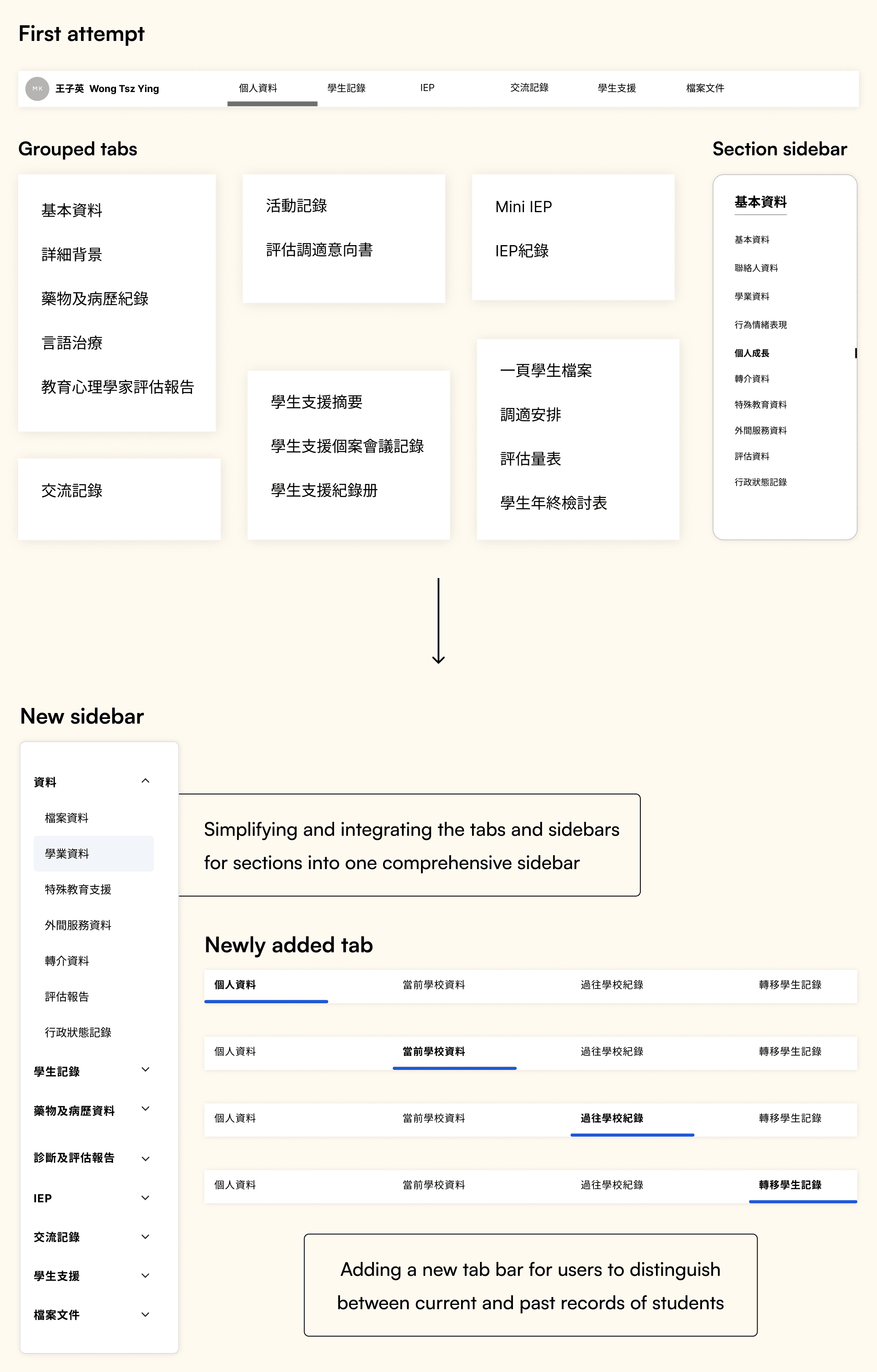
With over 15 tabs in total under each student profile and still counting, we brainstormed some ideas on how to optimize the architecture so as to facilitate easy navigation.
Original design of the page
Show all tabs in a row for users to scroll horizontally
Con
— Not user friendly as it takes efforts to find a specific page due to the huge number of tabs (and counting)
— Stacking so many sections in a single page without nav bar might prolong the searching process
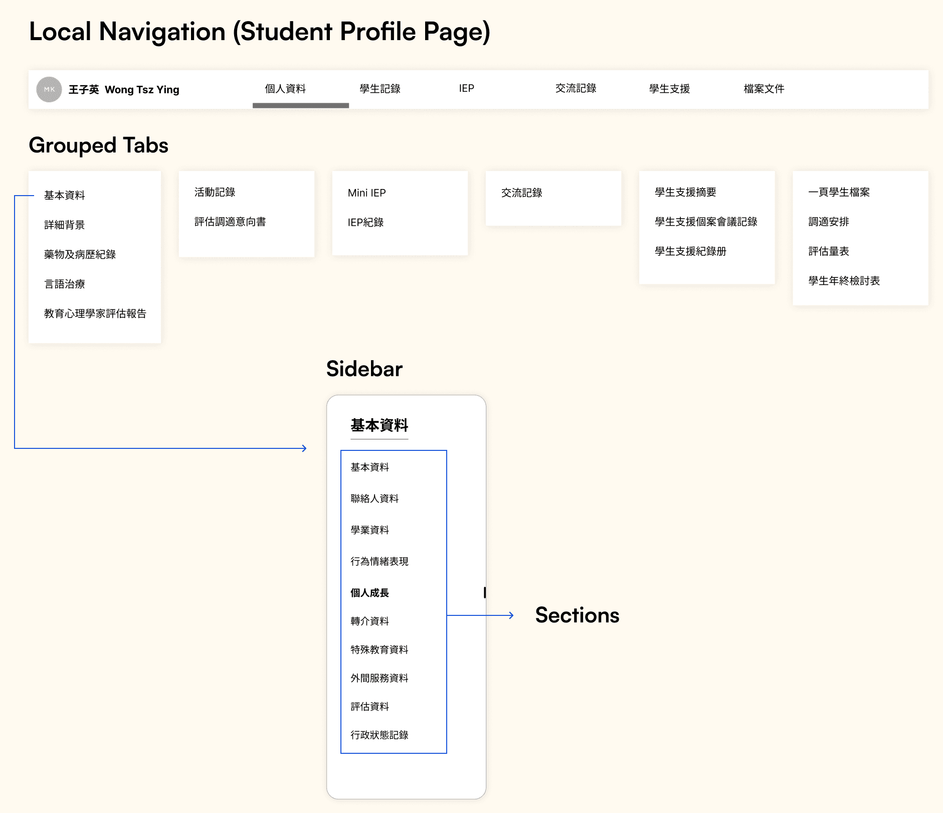
Group tabs with similar properties into six categories, and incorporate sidebar for users to navigate through different sections within a tab
Pros
— Clearer hierarchy for users to understand and navigate through
Cons
— The current grouping might not be ideal for backend development as only some users have access to certain tabs, hence need to consider the problem of permission
— With the newly introduced feature, users can see the past records of students transferred from their previous schools. To avoid inconsistency of data record, it'd be better to separate between the records of past and present
First attempt
Understanding the technical difficulties, we discussed on how to redesign the architecture of the tabs to balance between user, business needs and feasibility. We first simplified the tabs and grouped them into three categories: background info of students that stay unchanged even after the transfer of the entire set of records, current school records and past records transferred from other schools. This structure not only helps backend developers understand what documents can be transferred hence be able to optimize the database, but also allows users to distinguish between the current and past records to avoid confusion.
Latest version of sitemap
Modified design
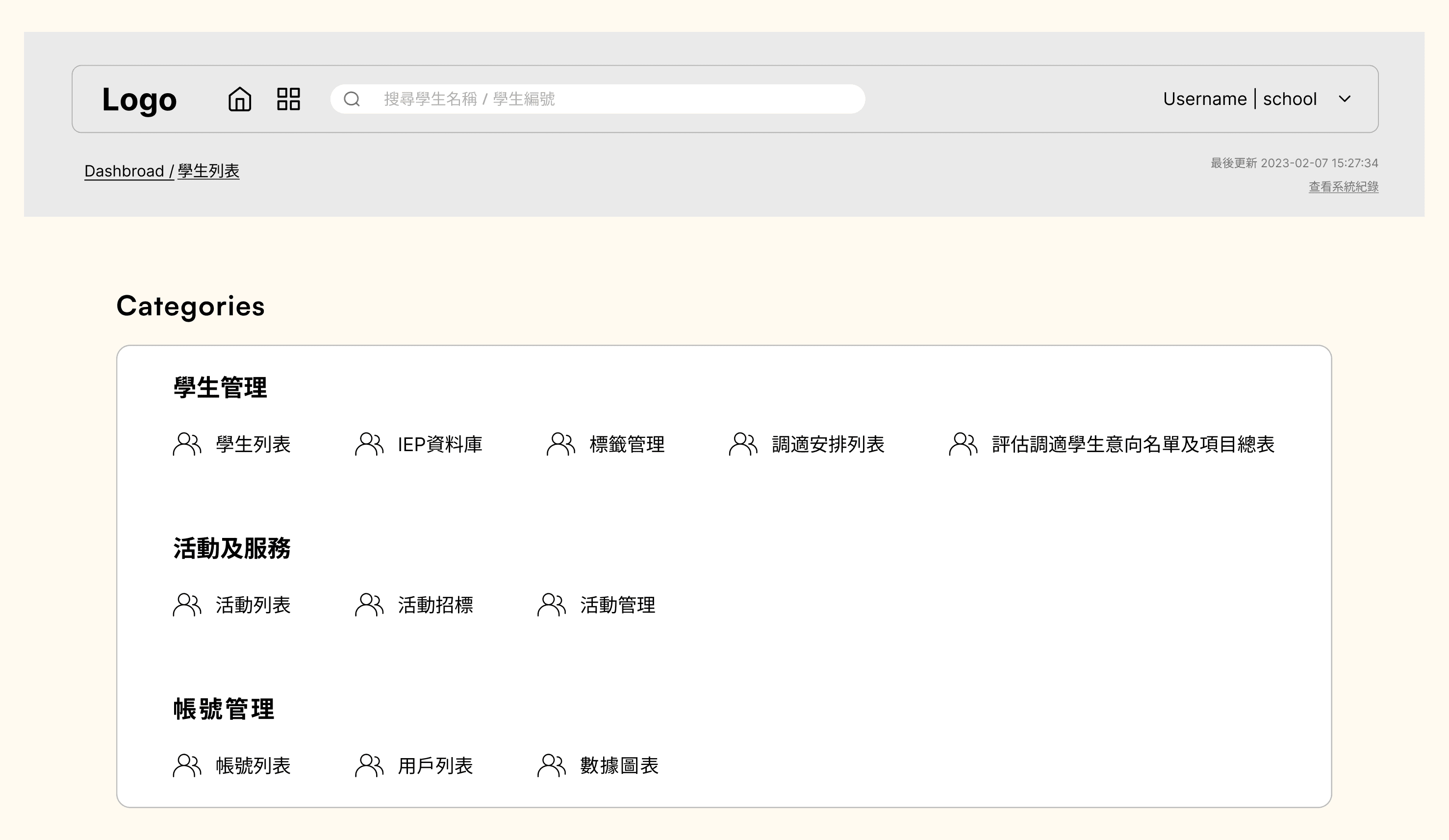
I also drafted the mid-fi prototypes of the homepage and the tabs.
After confirming the overall art direction and navigation, I continued to create wireframes for other pages including the homepage, content of each tab and lists that allow users to view the records of all students at one place.
#1: Homepage
Before jumping into designing, I first evaluated the current system and discussed with the team on what features should be incorporated in the page. As the current homepage was just a table showing a list of users, there wasn't much information and features. After consideration, we decided to highlight key information of the system and provide shortcuts to other pages for faster navigation.
Items to be included in the new homepage
Final prototype of the homepage
#2: Tabs
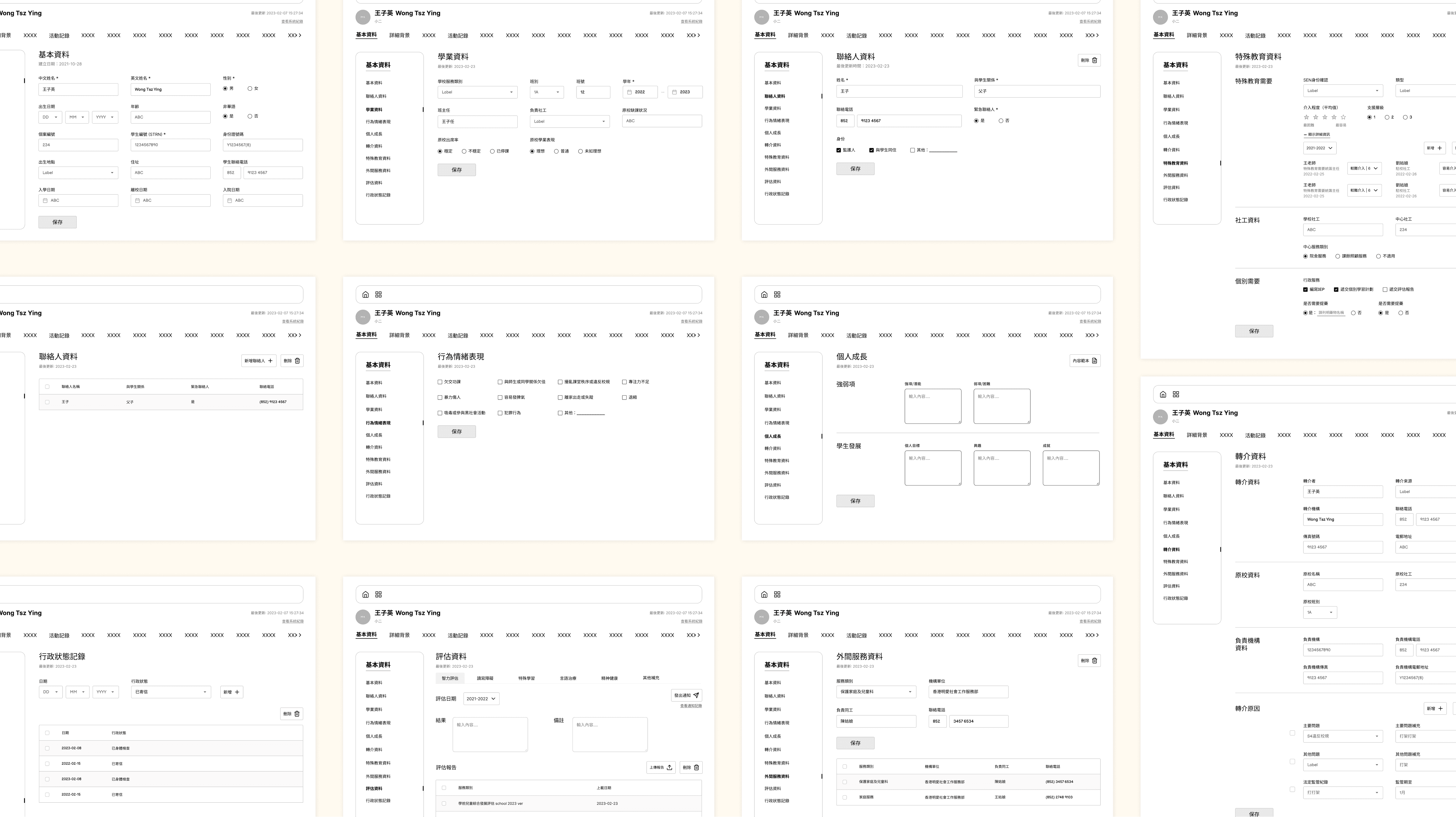
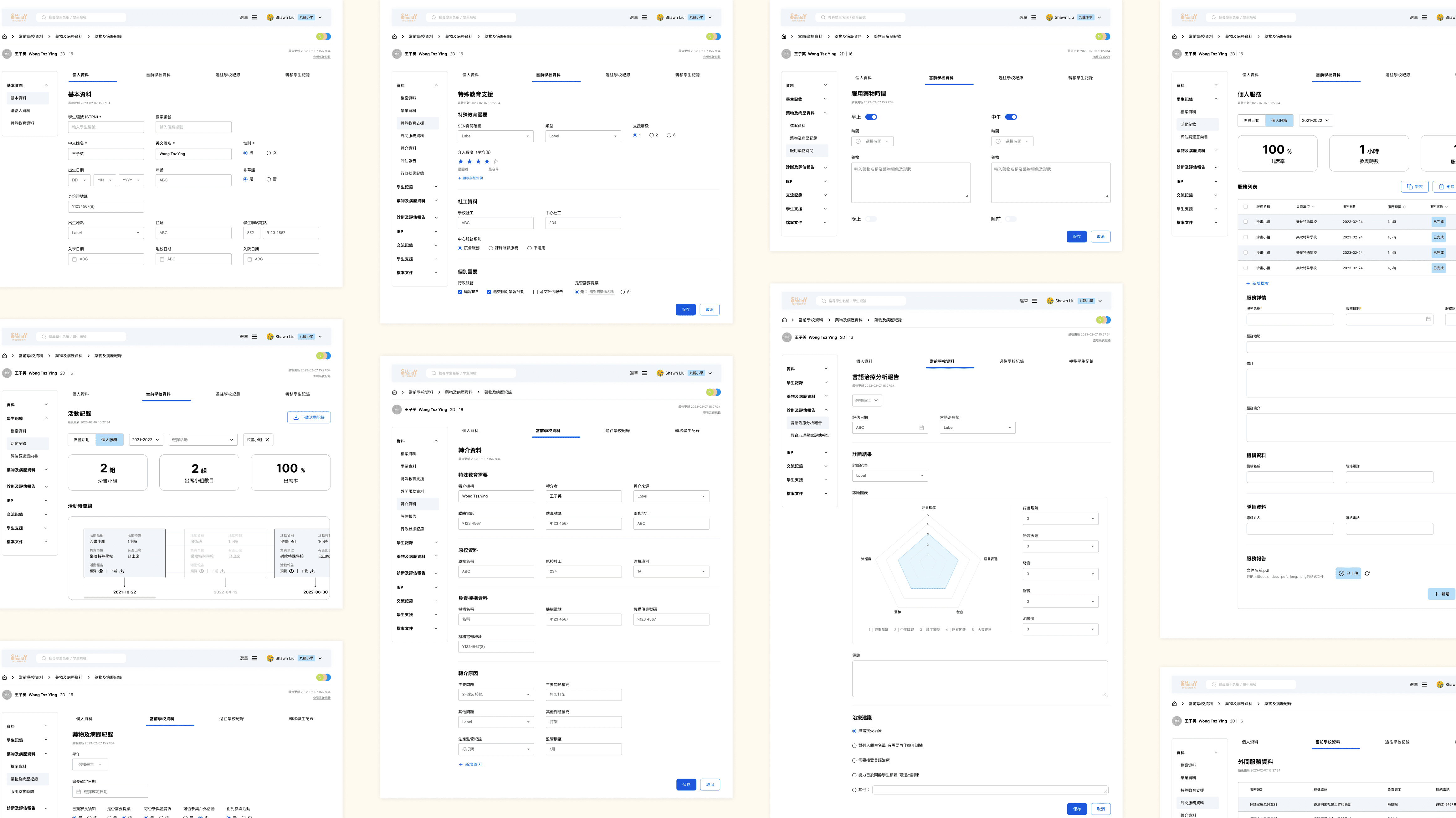
As most of the tabs are for documenting written records such as the kind of support students need, academic performances and reports of therapy sessions with medical professionals, the content is mainly presented as tables and forms. As an example, below are the wireframes of a tab under the student profile page showing the basic information of students.
Current design of the basic information page (stacking all sections in one page)
Proposed layout and wireframes (break down sections into multiple pages with sidebars)
After drafting the frames, I sought feedback from the team concerning the user experience and feasibility. After discussion, we modified our design based on the comments raised by the backend team, who voiced out the potential technical conflicts between data storage and the positions of the buttons such as add, save and cancel. We also faced challenges in developing reactive elements such as pop-up and dynamic fields in a data-intensive application. Hence, we decided to simplify the designs by amending the layout, text fields and buttons, while at the same time taking reference to the old design and incorporating the new style and navigation components created.
Hi-fi wireframes of the new design of tabs
#3: Lists
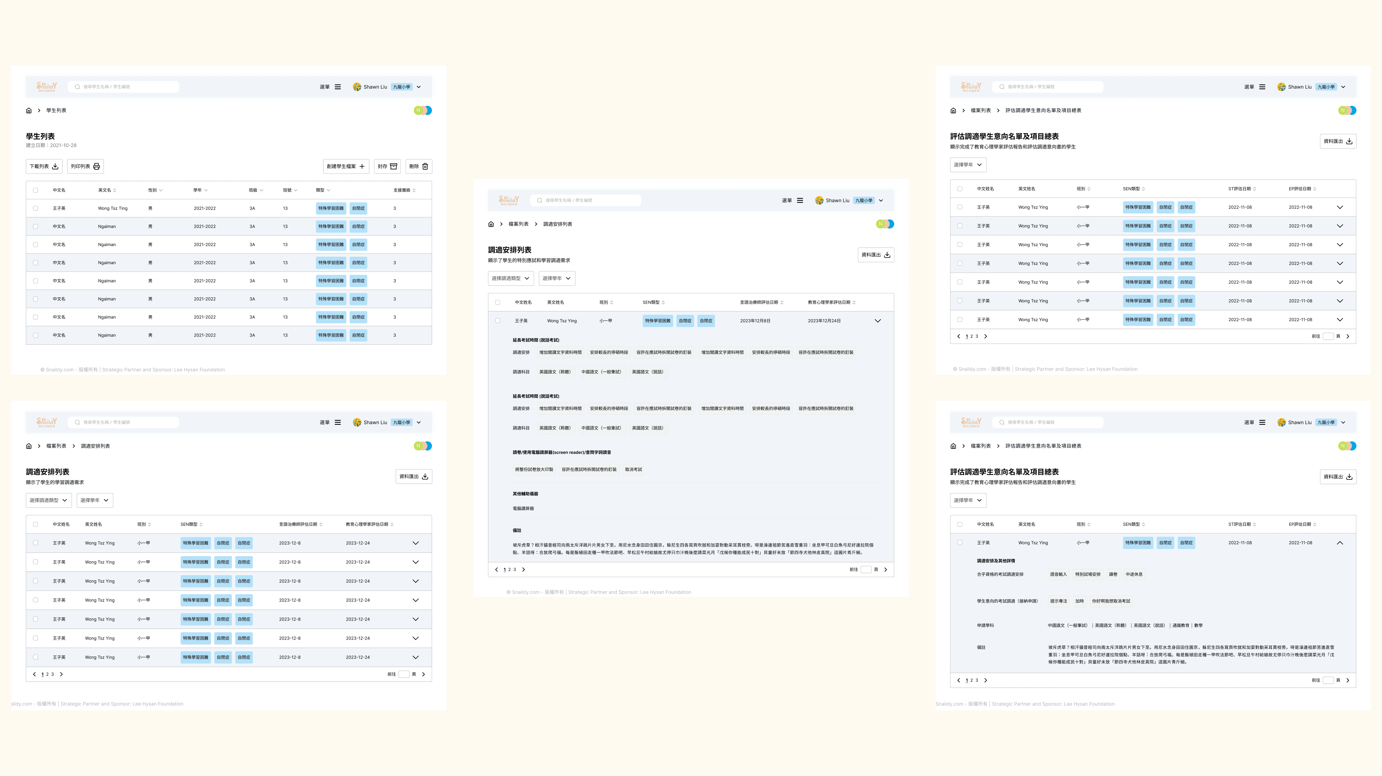
Apart from the form tabs, there are also a few pages that only allow info viewing instead of editing. To facilitate rapid browsing, I designed the interfaces in a clean table style.
Original design of lists
Hi-fi wireframes of the new design of lists
Feedback
The team was very satisfied with my works and the fact that I considered different perspectives from user to business needs to technical feasibility. As the product is still under development and will be launching in June, we do not have any significant feedback collected. Yet, the users, whom we invited for a simple usability testing amid designing, were glad to see that the system appears to be much more user friendly and clean.
Challenges
Developing a data-intensive application, we faced different obstacles in balancing between user needs and technical feasibility. Not only did we have to consider the user-friendliness and aesthetics of the interfaces, but also think about whether it can be developed by the programmers considering different factors such as data storage and permission. Therefore, it is unavoidable that we had a lot of frictions with the backend developers.
In a start-up, an unorganized workflow is also a huge problem derailing the process and hindering effective communication. Without a clear timeline and work delegation, we couldn't manage time efficiently and fail to give out concrete deliverables in the beginning. Things also changed rapidly depending on business needs and the development progress, hence need to be highly adaptable and resilient to changes.
Despite the difficulties, we managed to pull together and design a product that actually helps users.
Things to Improve
With tight deadlines, we were reluctant yet had to compromise under difficult circumstances. For example, a more in-depth primary research involving designers and the development team should be conducted for us to understand the frustrations of users, rather than designing based on the narratives of a few. If we had more time, the interfaces could have also been designed as more user-friendly and consistent by creating a comprehensive design system. More efforts on UX writing should also be invested. While at the same time, we should also have second thoughts before introducing some new features and large-scale modifications to the system.
Creating a one-stop B2B website bridging event vendors and schools for activity browsing and quotation
