Company
Bilby.ai serves as a corporate artificial intelligence solution for comprehending China's regulatory risk. Processing millions of documents from China, Bilby has the capacity to offer insights and forecast on alterations in the regulatory sector that could impact both niche and broad industries.
Background
Before the launch, they delivered the insights gathered by in-house analysts and machine learning technologies via a report. Aiming to transform a static report with interactive elements for enhanced user engagement, Bilby aspires to elevate their existing offering through the application of query-based AI. Specifically, they seek to amplify the interactions with the report by leveraging powerful AI instruments, including surfacing data and generating summaries from the report using queries.
Role
As the UX Designer at Don't Overthink, a design agency, I teamed up with the creative director and a UI designer to build the product from scratch by conducting UX research, ideating and providing innovative solutions. We were expected to provide a ready-to-develop interface for their internal developers within a month.
#Research
Understanding what Bilby wants is how we begin.
We initially familiarized ourselves with the product specifications and invited the CEO for a stakeholder interview to explore the details prior to delving further. During the discussion, we gained greater clarity about their objectives and goals, the business offerings, industry landscape and technical aspects. In short, a clean and simple interface with concise responses gathered from reliable sources was expected.
We gained a better grasp concerning users' needs through interviews and secondary research.
Prior to seeking our help, Bilby has already conducted over 100 interviews with their clients internally and gathered insights regarding their expectations, needs, behaviour and frustrations. Yet, our team decided to host a few more interviews for us to gain clearer perspectives and inspirations.
To dig deep into the entire experience, we focused on investigating their journey in interacting with the report, their current habits in receiving information related to China regulatory policies, as well as their expectations or aspirations on the product or the evolution of the business in general. Questions about their background and impression on AI were also asked to gauge their digital literacy and their experience with new technology.
Personas
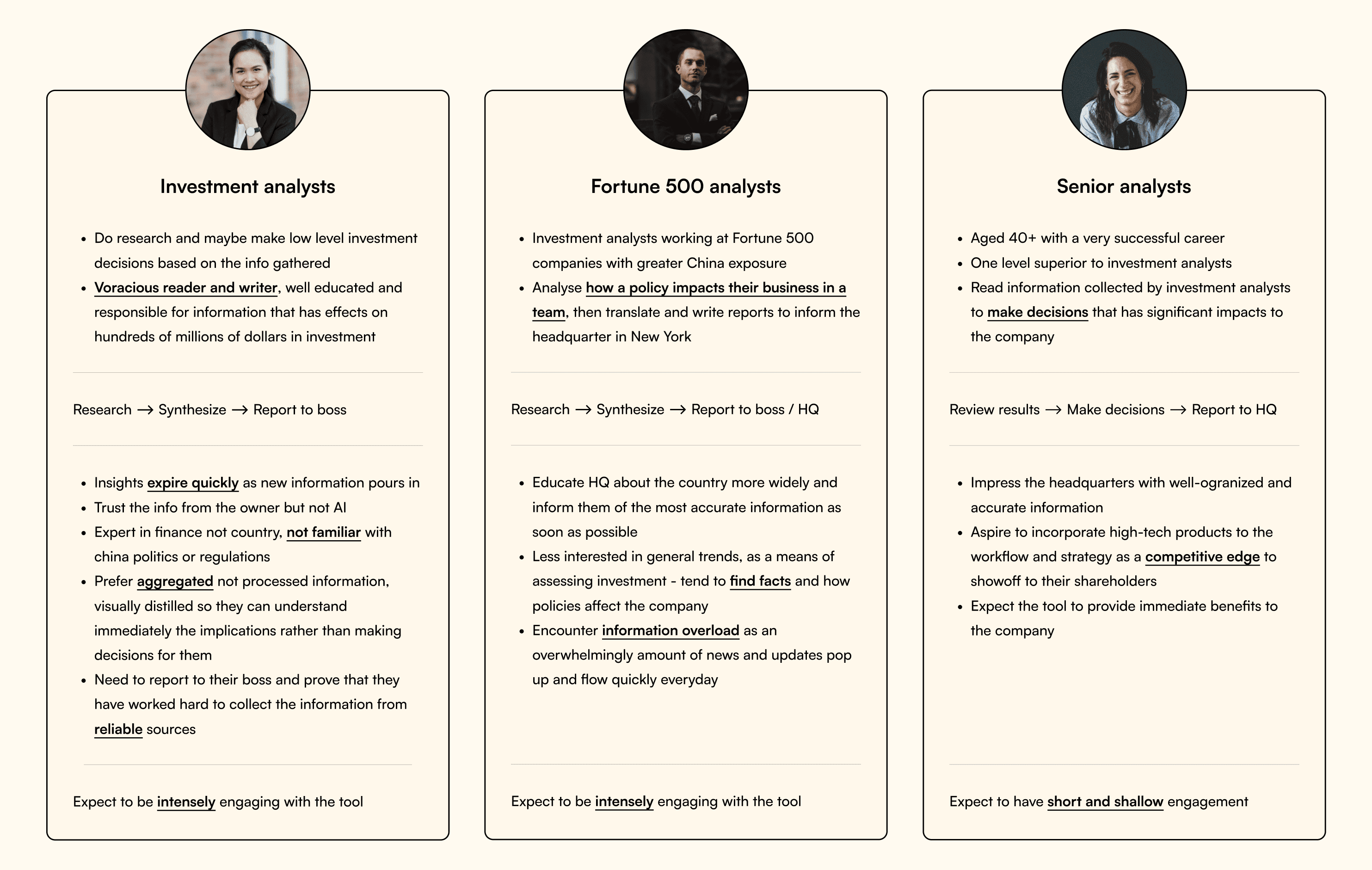
Offering solutions to global financial firms, Bilby boasts an extensive clientele consisting of investment specialists and finance professionals. Though their job nature may be alike, each individual has unique needs, objectives and problems when engaging with the current report.
Personas representing 3 types of analysts
Secondary research
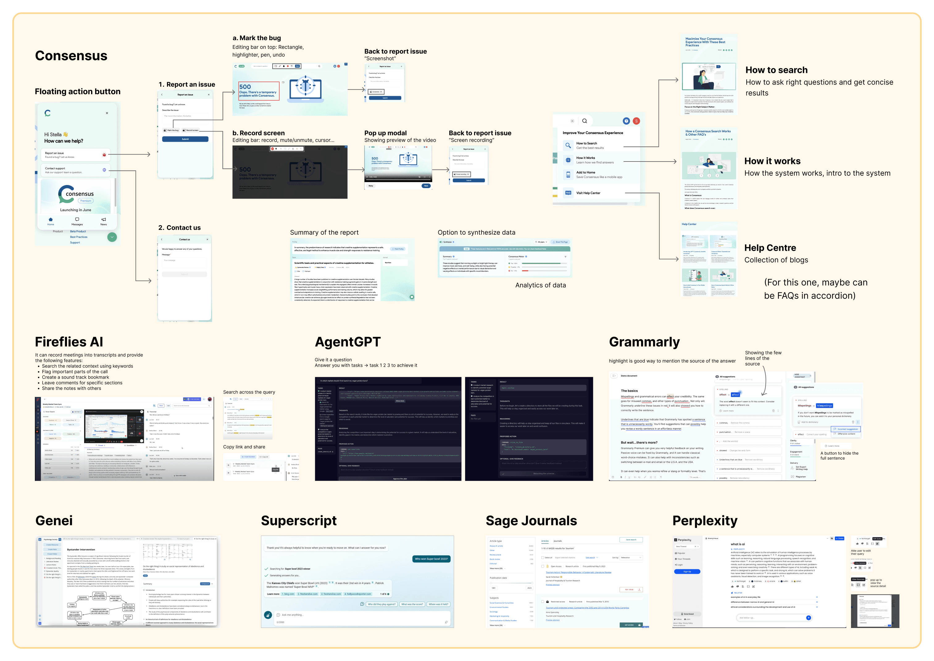
As the implementation of artificial intelligence within the industry remains relatively novel, we have carried out in-depth analysis on comparable products and research platforms including UX, UI and interactions, for us to understand the standards and user expectations. Notably, ScienceDirect and Sage Journals contain extensive academic articles, while Consensus, Fireflies AI, Perplexity, and AgentGPT serve as a few all-encompassing AI research tools that we referenced for their features and interface designs.
Snapshot of the partial insights we gathered from the research
#Ideation
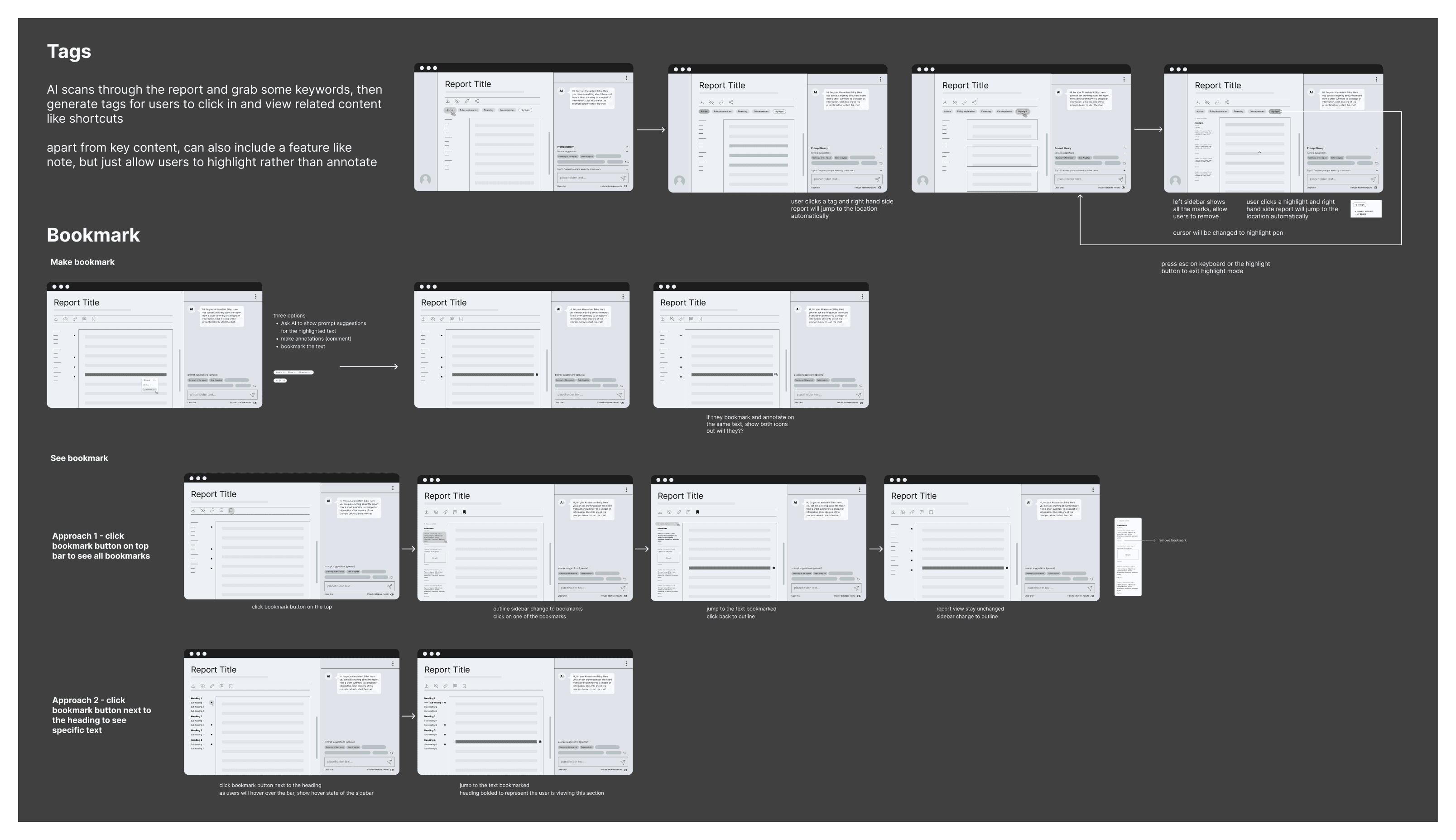
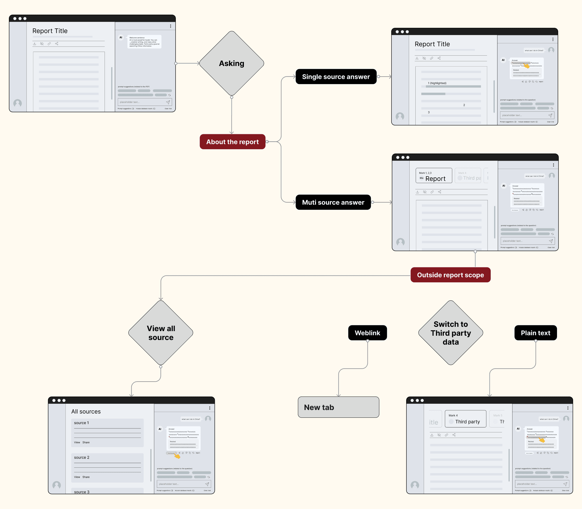
Expected flow of user interacting with the tool
Diagram demonstrating the affordances, signifiers and feedback within the system
#Feature Highlights
We proposed different innovative solutions to enhance the interaction of users with the report as well as the AI chatbot.
Once the user journey and product structure were outlined, we began refining concepts brainstormed earlier and presented them to the client, showcasing key features as below.
#1: General UI
Before delving into the details, we first proposed several ideas on the general interface.
Initial idea
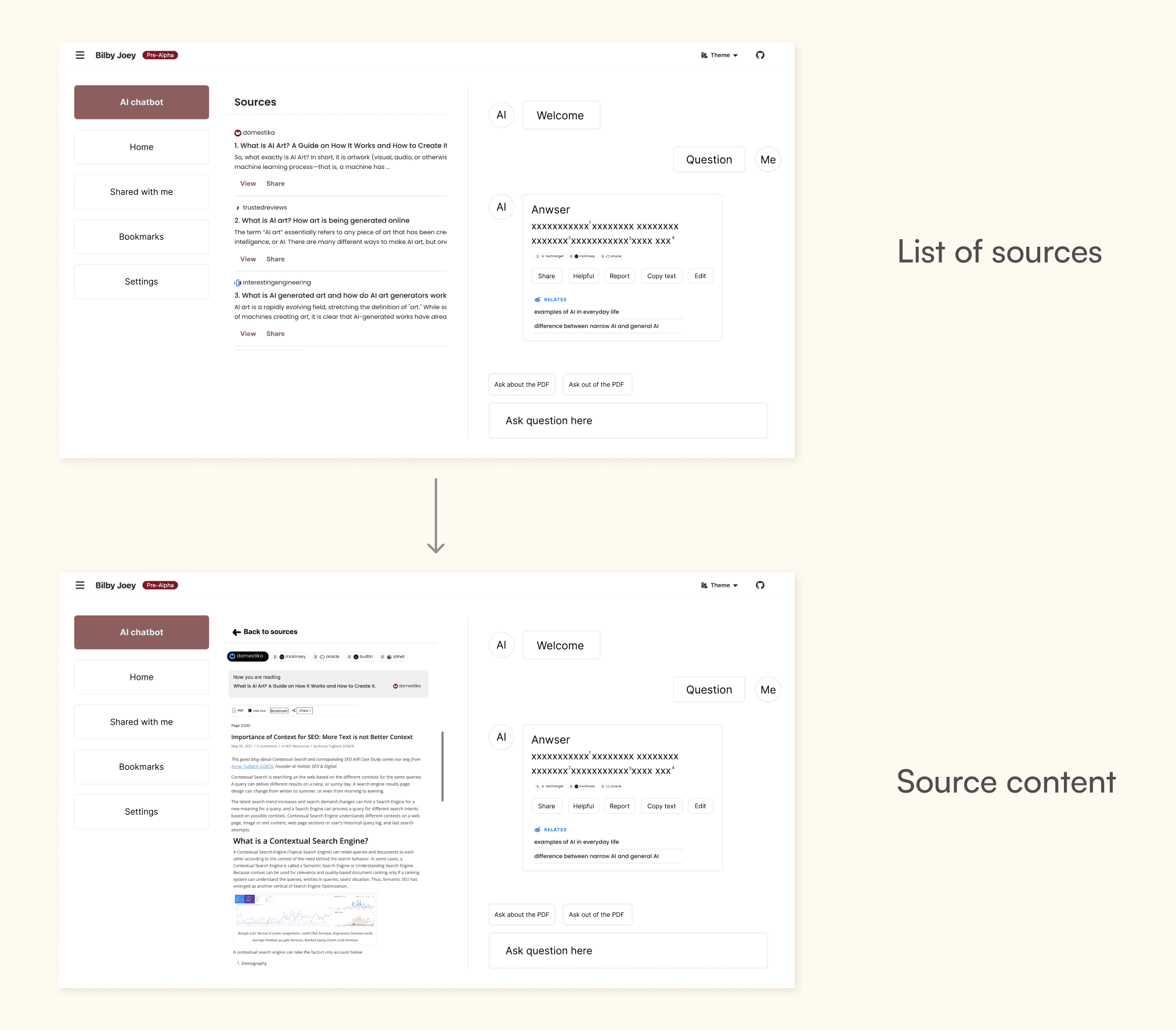
We sketched out this three-column layout during a design sprint at the beginning of the project. The original concept was to facilitate rapid navigation throughout the platform with shortcuts provided in the first column, present a list of sources that constitute the responses in the second column, and allow users to interact with AI in the third column. The content would show up once clicked the source.
Yet, we abandoned this idea considering how cluttered hence user-unfriendly the design would be, while allowing users to view the report might be more suitable.
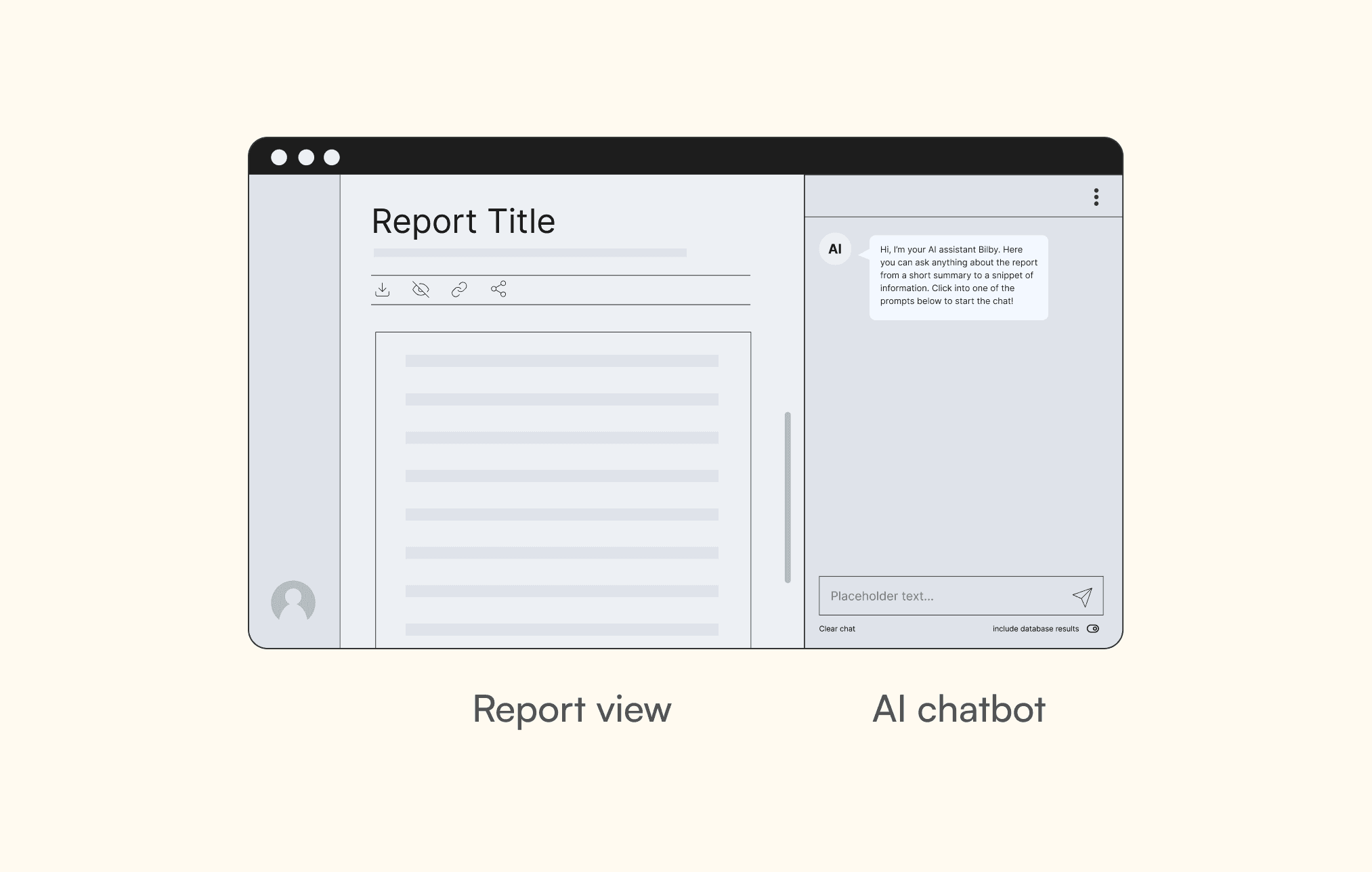
Following thorough research and referencing current research platforms, we concluded that a two-column design may offer a neater and more streamlined solution, integrating both the report to the left and AI chatbot to the right. In this case, users have the ability to query the AI directly when seeking clarification on the material, and vice versa.
Final idea
#2: Query input
A primary objective of ours is to reveal data from the extensive report based on user's queries. Beyond the conventional ask and answer way, we endeavor to incorporate novel approaches to offer users enhanced adaptability and ease in inputting queries, which remains one of the biggest challenges anticipated when interacting with AI.
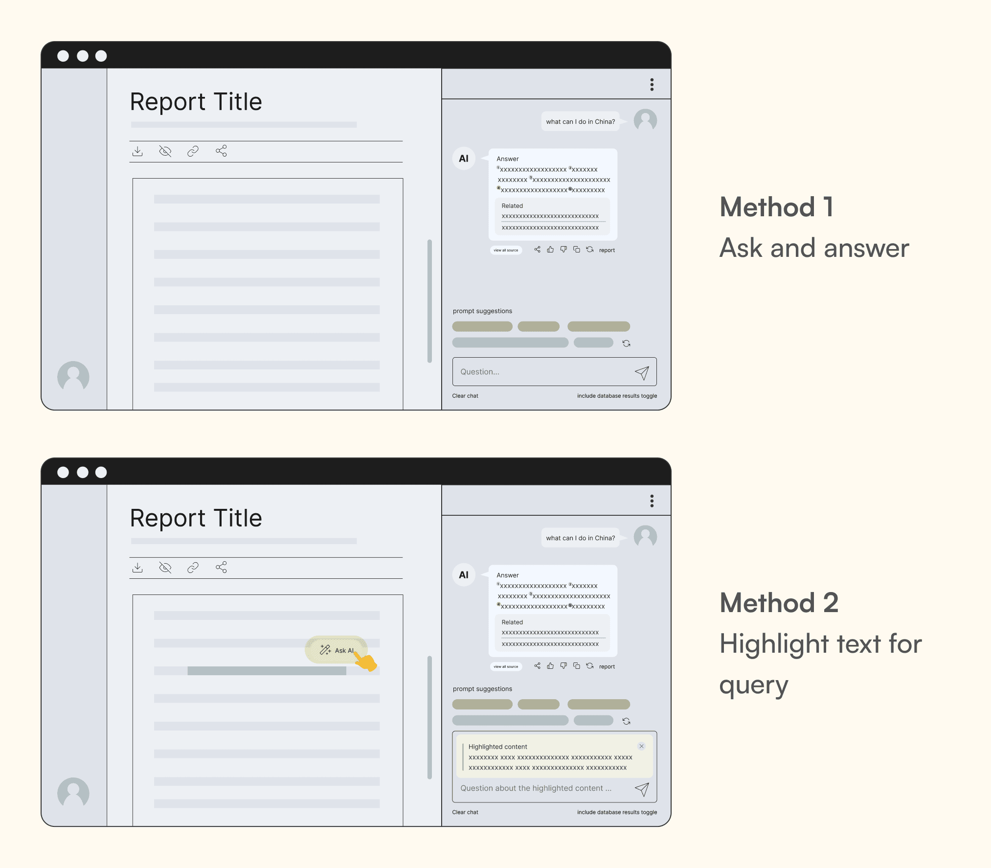
Methods to ask AI questions
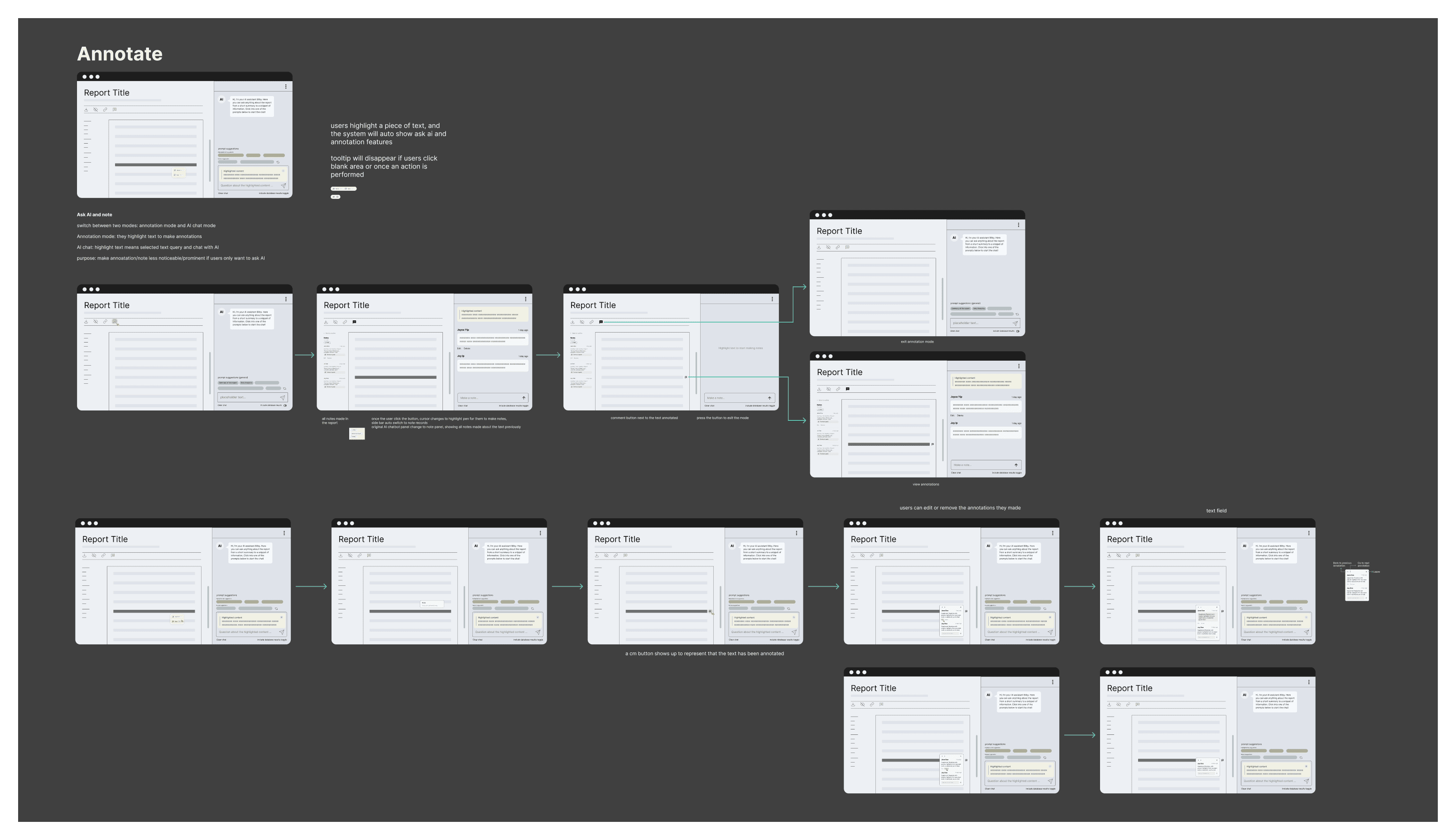
We proposed two solutions including the common approach initiated by ChatGPT, and introduced a more intuitive one that allows users to simply highlight a snippet of text and ask related questions. This reduces the efforts of manual typing and encourages diverse asking styles.
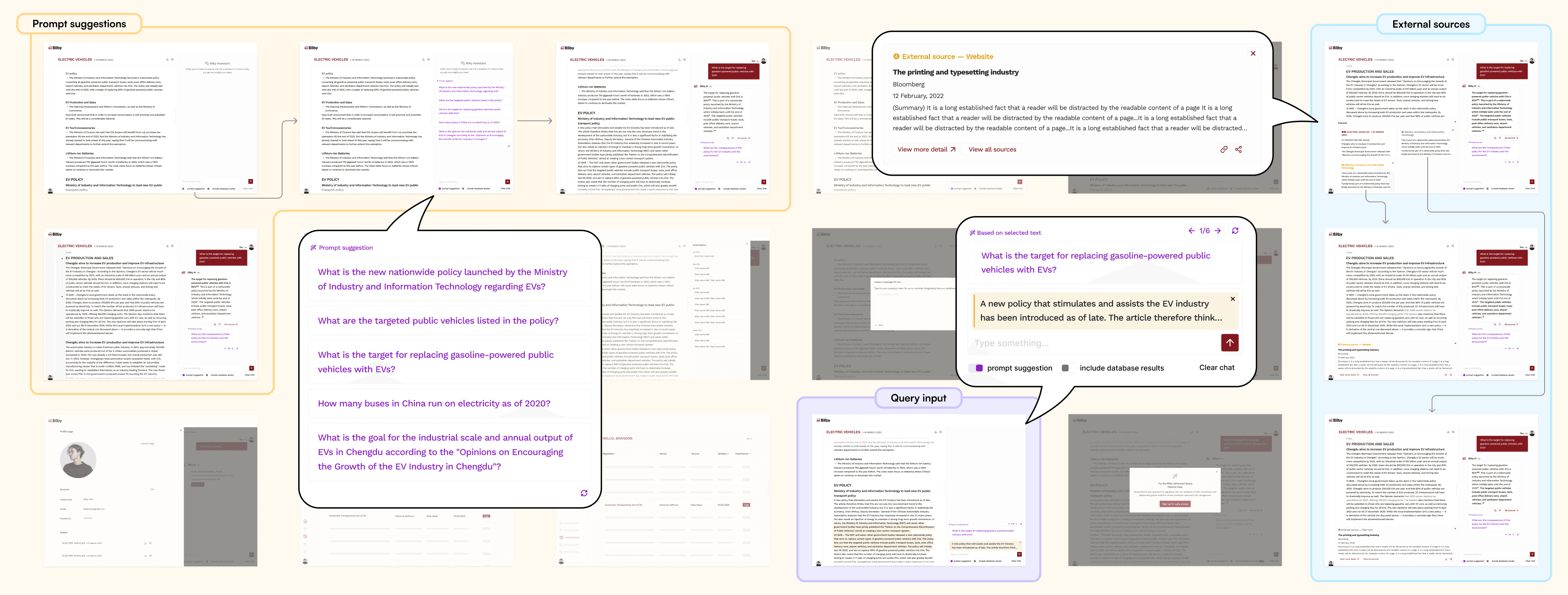
#3: Prompt suggestions
As aforementioned, users have no clue about what questions they can or should ask while interacting. Thus, suggesting a list of prompts helps users initiate the conversation with guidance.
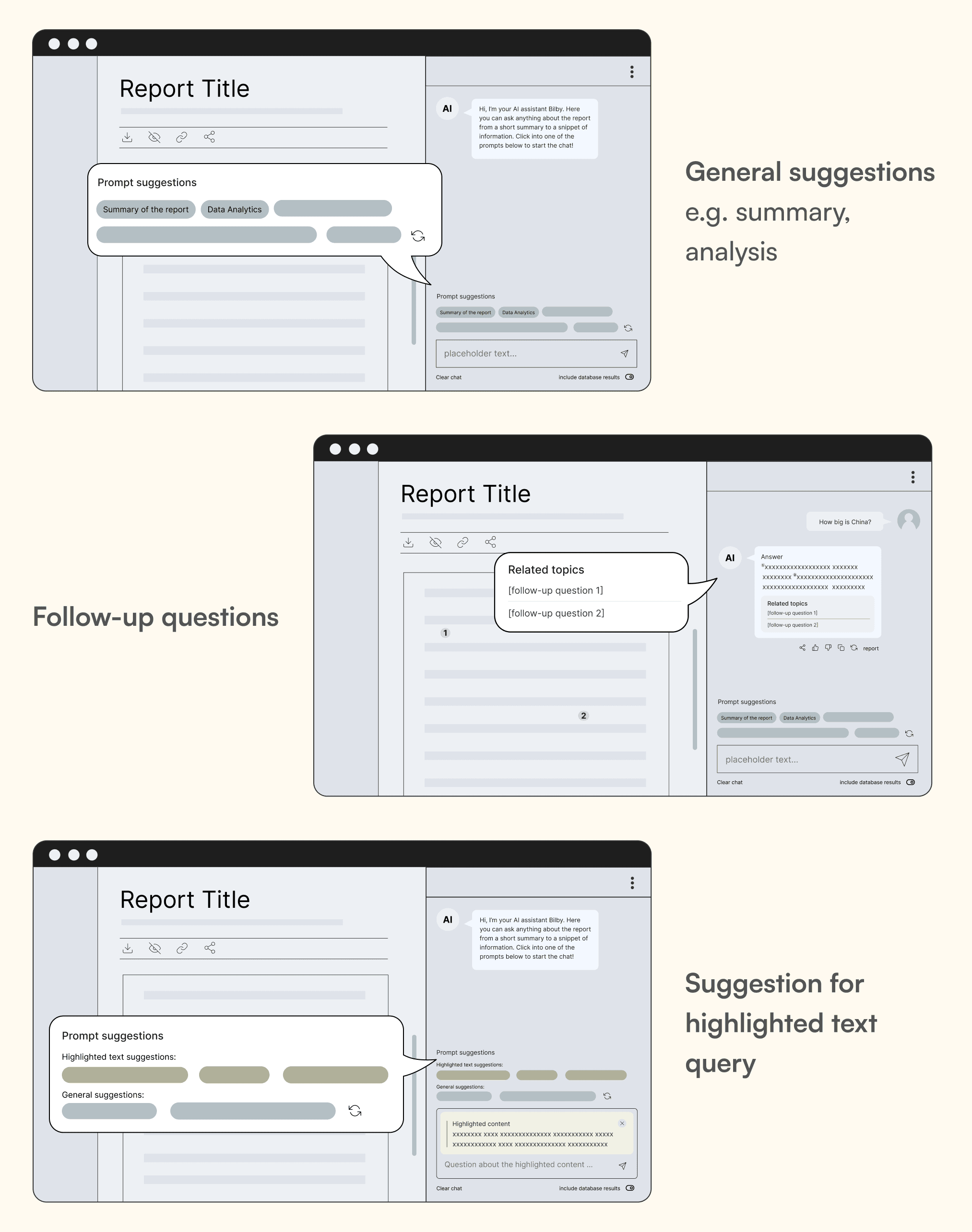
Initial design with three kinds of prompts
We initially decided three types of prompt suggestions we would like to incorporate to minimise efforts: general prompts e.g. summary of the report, as well as suggestions on what follow-up questions to ask.
Suggestions for highlighted text are also accommodated. Once users highlight a snippet of text in the report, a button "Ask AI" would be shown as an option for them to proceed to post questions in the chatbot. Meanwhile, some examples would be provided along with that for the general prompts.
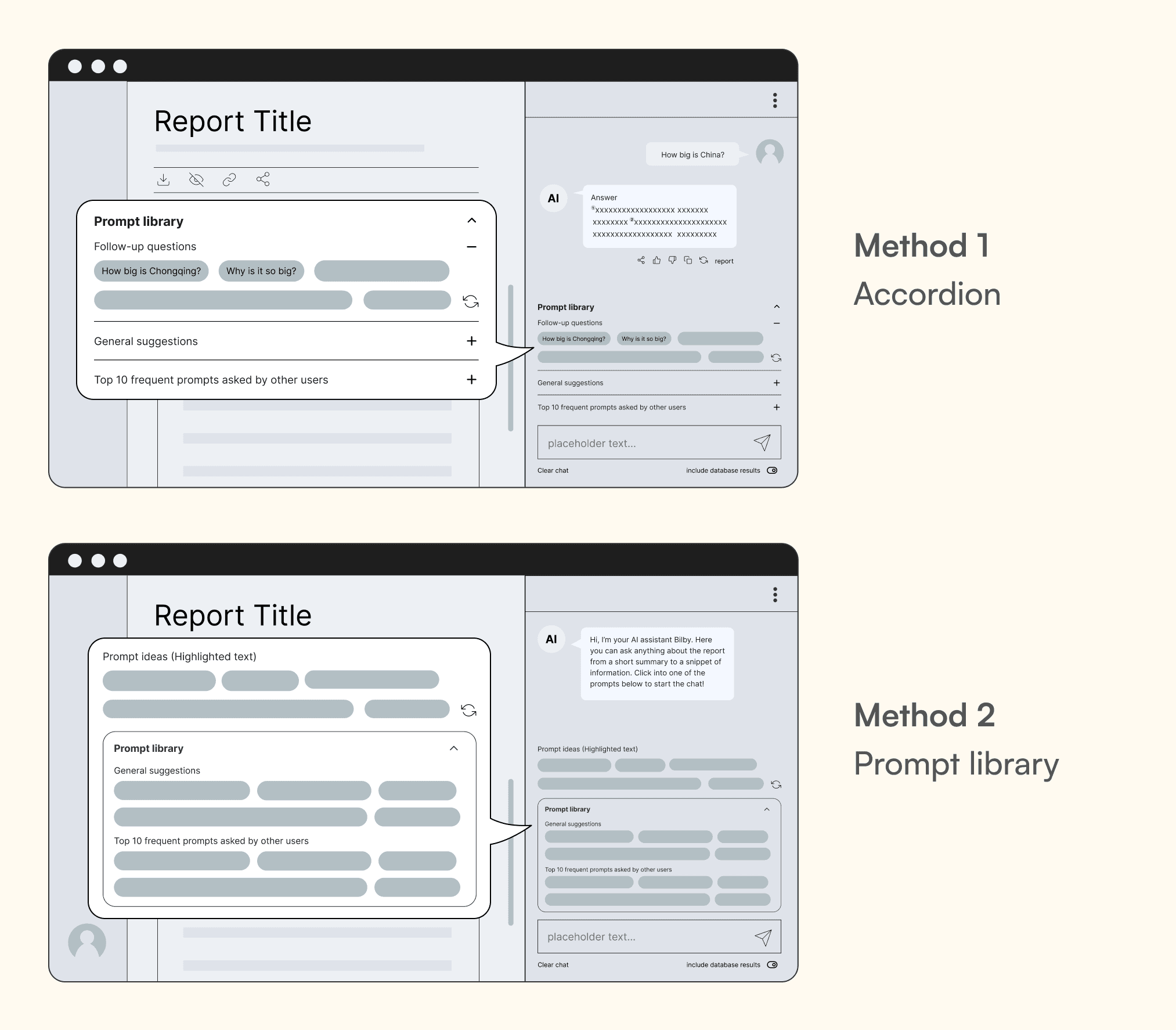
Upon proposing to the client, they suggested including frequent prompts generated by other users so as to foster community engagement. We tried to integrate by classifying various kinds with collapsible accordions, or an expandable prompt library with suggestions shown once clicked. Yet, the design was very cluttered and the significance of community building towards user experience was questionable.
Iterated design based on client's advice
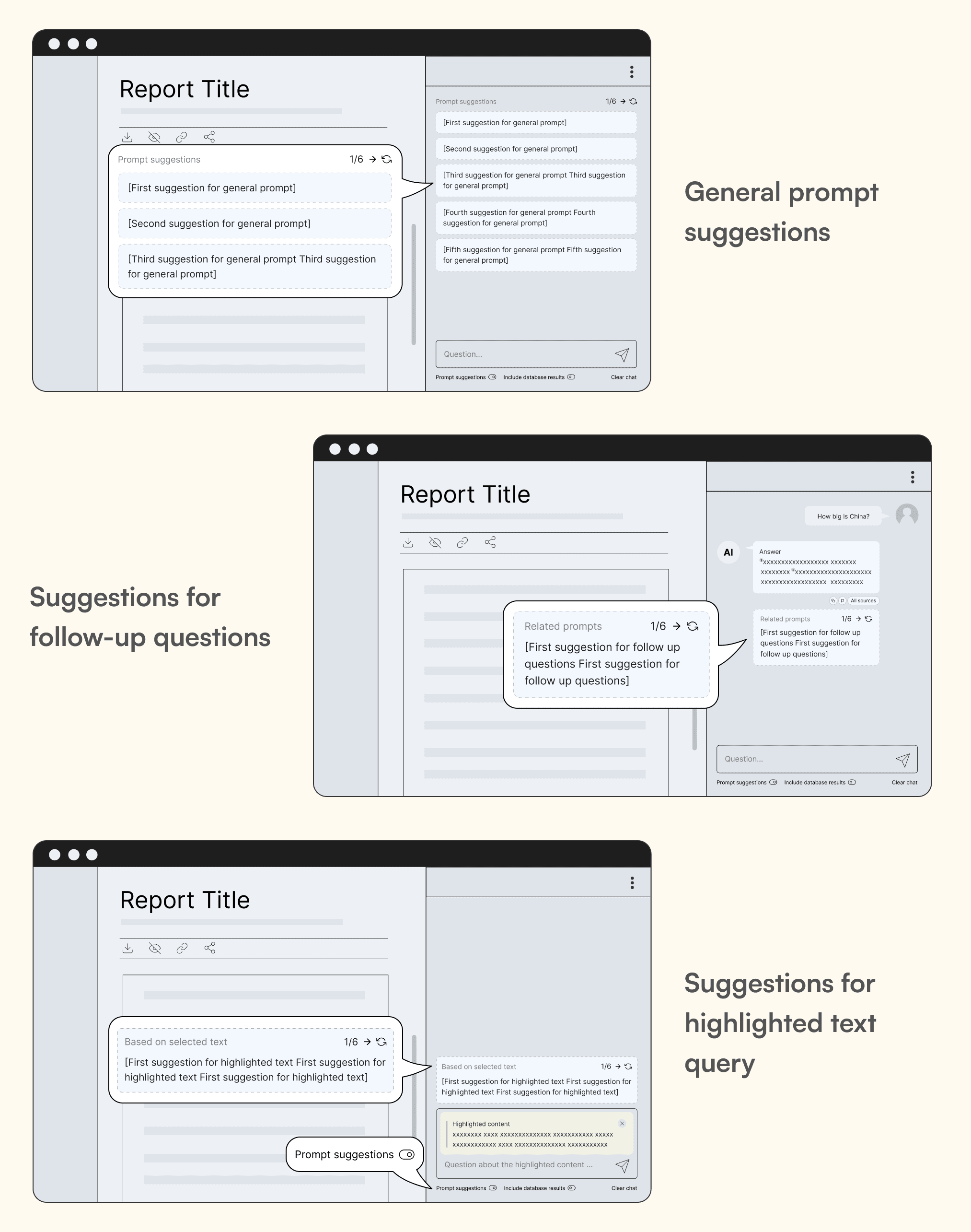
Final design
Taking into account the minimal impact on users and the overcrowded layout, we chose to retain the initial idea that includes three varieties of recommendations, but with a more proactive and streamlined interface, in which only one type would be shown depending on the interaction with the AI. For instance, when users highlight a section of content, only suggestions pertaining to that piece would be displayed, leaving out general suggestions, given how visually congested the presentation would be. Users can choose to toggle off the prompt suggestions.
#4: Sources of the responses
In terms of the sources that make up the AI responses, we were alert that credible source is very much demanded by the users, hence not only the origins have to be trustworthy, the interface should also be designed in a professional and neat look and feel. The challenge was how we could distinguish between different sources in the response, and how the content is presented.
a. How to distinguish between different sources in the response
A response is composed of internal (from the report itself or from Bilby's database with millions of references) and/or external sources (websites and plain text) that are denoted using superscripts. Number that constitutes the superscript represent the quantity, while the colour signifies the origin of the sources. For example, source #1 and #2 in red come from the same source, while #3 in blue belongs to another one.
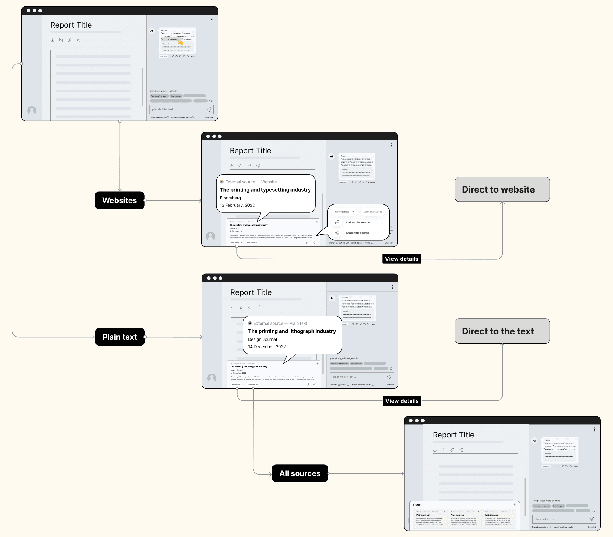
b. How to present the full content of the source
Initial idea on the presentation
There are two ways of presentation: single (report) and multi source. The cards at the upper left differentiating the sources would reveal when there are more than one source. Users would be routed to the respective pages if they click on external sources including websites and plain text. A full list would be shown if they indicate their preference to all of them by clicking the button "View all sources" beneath the response.
Cons
— Cluttered interface if summary and other information regarding the sources, which facilitate efficient browsing, are also contained inside the card
— Unessential emphasis on the highly-visible sources overshadowed the importance of the content
— Users couldn't see both the content and the source list simultaneously once opened
We decided to replace the topmost cards with footnotes for the presentation of external sources. Same way to trigger, however in this context, a card would be shown at the bottom, featuring the title of the article, date published, the author and a short summary. Mimicking real-life footnotes reading experience, we attempt to facilitate decision making process by simulating their behaviour.
Final approach
Upon finalising the ideas, we moved forward to create the UI.
After several back and forth discussions with the client, we finalised the functionality of the product and started to create the UI with additional features such as the a place to view conversation history, contact us form for marginal cases and profile page.
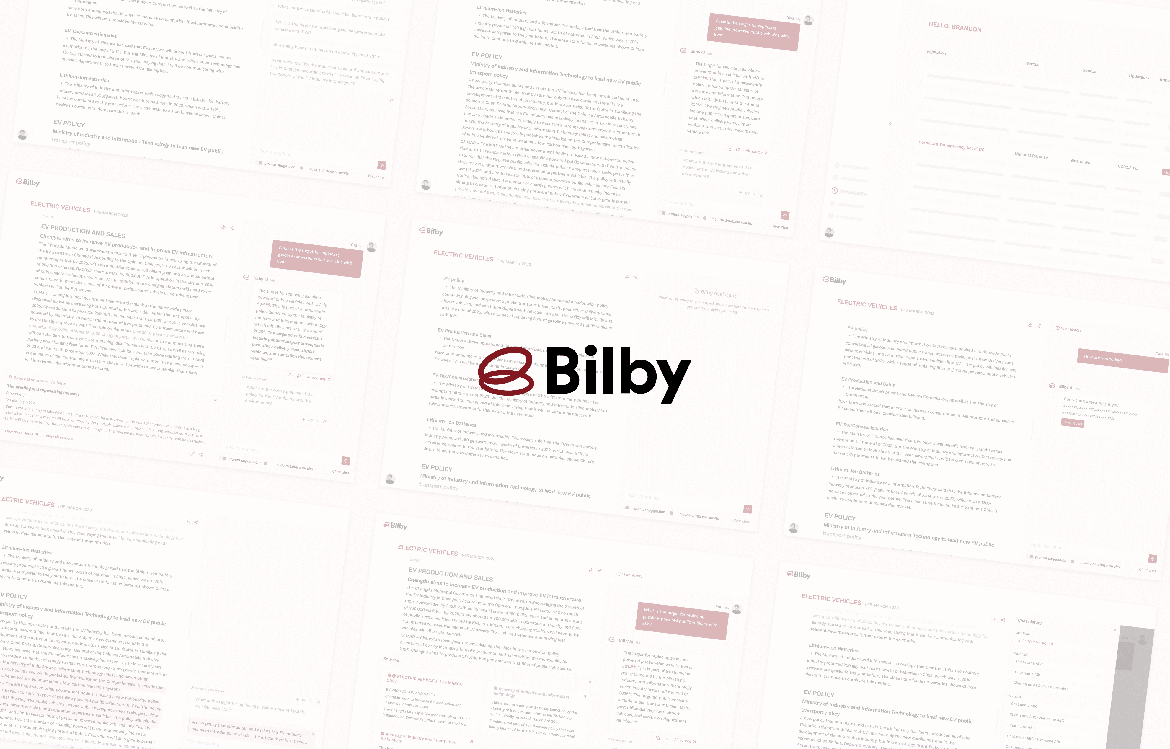
Final design of the product
Feedback
The client was jubilant to see their idea fully realised and how we elevated the experience with different solutions, especially the highlight text query which works like "magic", quoted. The design was then handed over to their technical team for development after finalising the design.
Challenges & Learnings
The domain of AI-powered research is relatively new, boasting only a handful of successful offerings thus far, necessitating the consideration during product development that our users might lack AI literacy. To wrap our heads around their viewpoints, extensive research of both users and the overall market were required. In the creation of our visuals, we strove to echo those seen in leading AI platforms to best align with user norms. Added features like suggestive prompts and a help section were weaved in to offer clear guidance.
Another central point is to thoroughly understand business and user requirements. Features should be made based on a fair balance between the two, instead of leaning on assumptions. AI plays a role in enhancing the experience, which should always revolve around the end-users. Building trust between human and machines is equally essential, which therefore emphasises the importance of reliable sources and a professional UI.
Redesigning a Cloud system to reduce the paperwork efforts of SEN (Special Educational Needs) support team
